Context
The patient never books their own appointment
Most patient portals are designed for the patient. Pediatrics breaks that assumption immediately: the account holder is a parent booking on behalf of a toddler, often juggling siblings with different physicians, different offices, and a shared insurance plan. Add HIPAA-driven proxy access rules that change as a child ages, and the standard portal template stops working.
Pediatric Associates engaged Hitachi Solutions to design a portal that treated the family, not the individual, as the unit of care. I led UX across the engagement: research synthesis, service blueprinting of the existing phone-based journey, workshop facilitation with the client's clinical and operations stakeholders, and end-to-end interaction design for web and mobile.
Research
Blueprinting the phone call we had to replace
Before designing screens, we mapped the existing scheduling journey as a service blueprint with front-office staff in cross-functional workshops. A typical booking call took eight minutes and touched three systems: the scheduler asked for the child, the insurance, the reason for the visit, and then negotiated a time slot by reading options aloud. Parents told us the same thing in interviews: they did not want an app for its own sake, they wanted to stop calling during nap time.
The blueprint gave the portal its backbone. Every question the scheduler asked became a design requirement: which child, which coverage, what kind of visit, which provider, when. The design goal was to answer them in that order, faster than the phone.
Design
A home page that works like a family fridge door
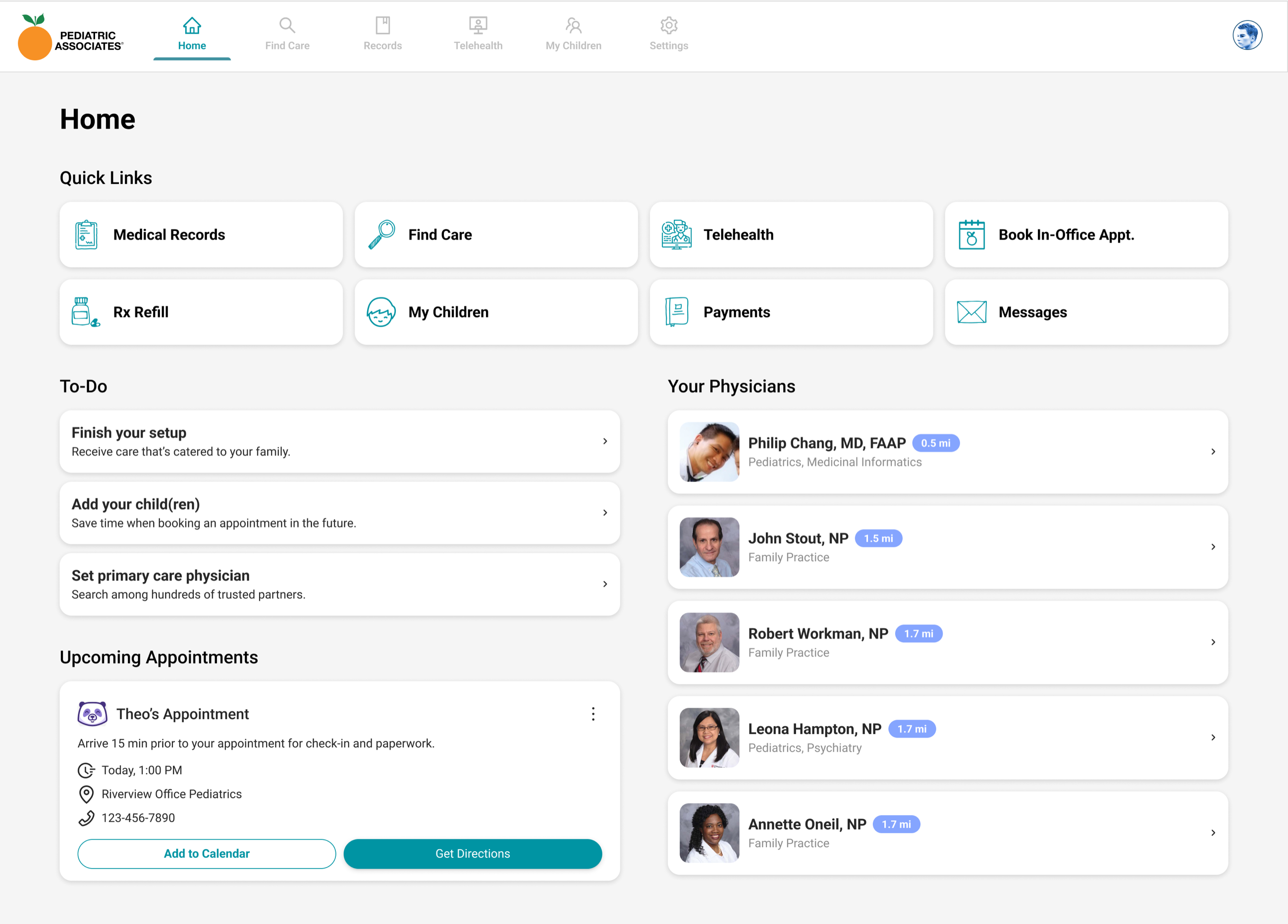
The signed-in home surfaces the three things parents check constantly: what needs doing, what is coming up, and who their doctors are. A to-do checklist drives account completion (add your children, set a primary care physician), and upcoming visits lead with the child's name and one-tap directions.
Find care the way parents actually search
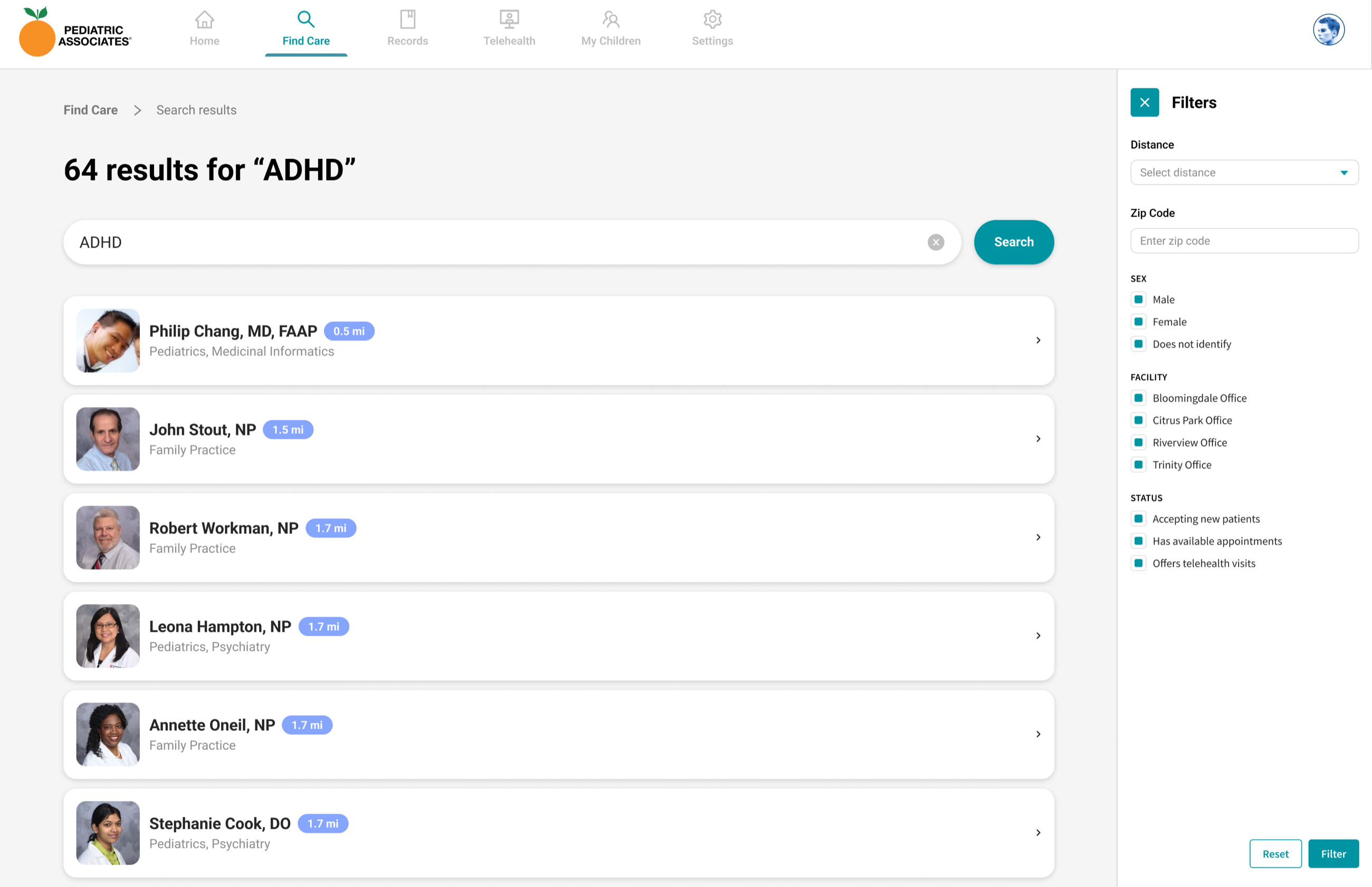
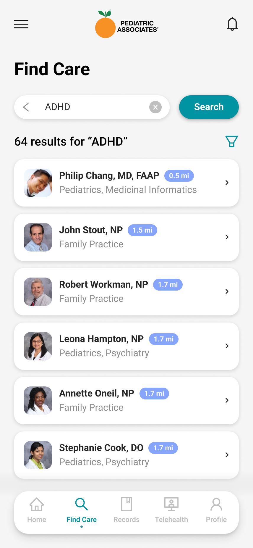
Parents do not search for "Board Certified Pediatric Psychiatrist." They search for what is happening: ADHD, rash, asthma. Find Care matches providers on conditions and symptoms, and its filters answer the questions that end phone calls: who is near me, who accepts new patients, who has appointments available, who offers telehealth.
Scheduling that answers the scheduler's questions
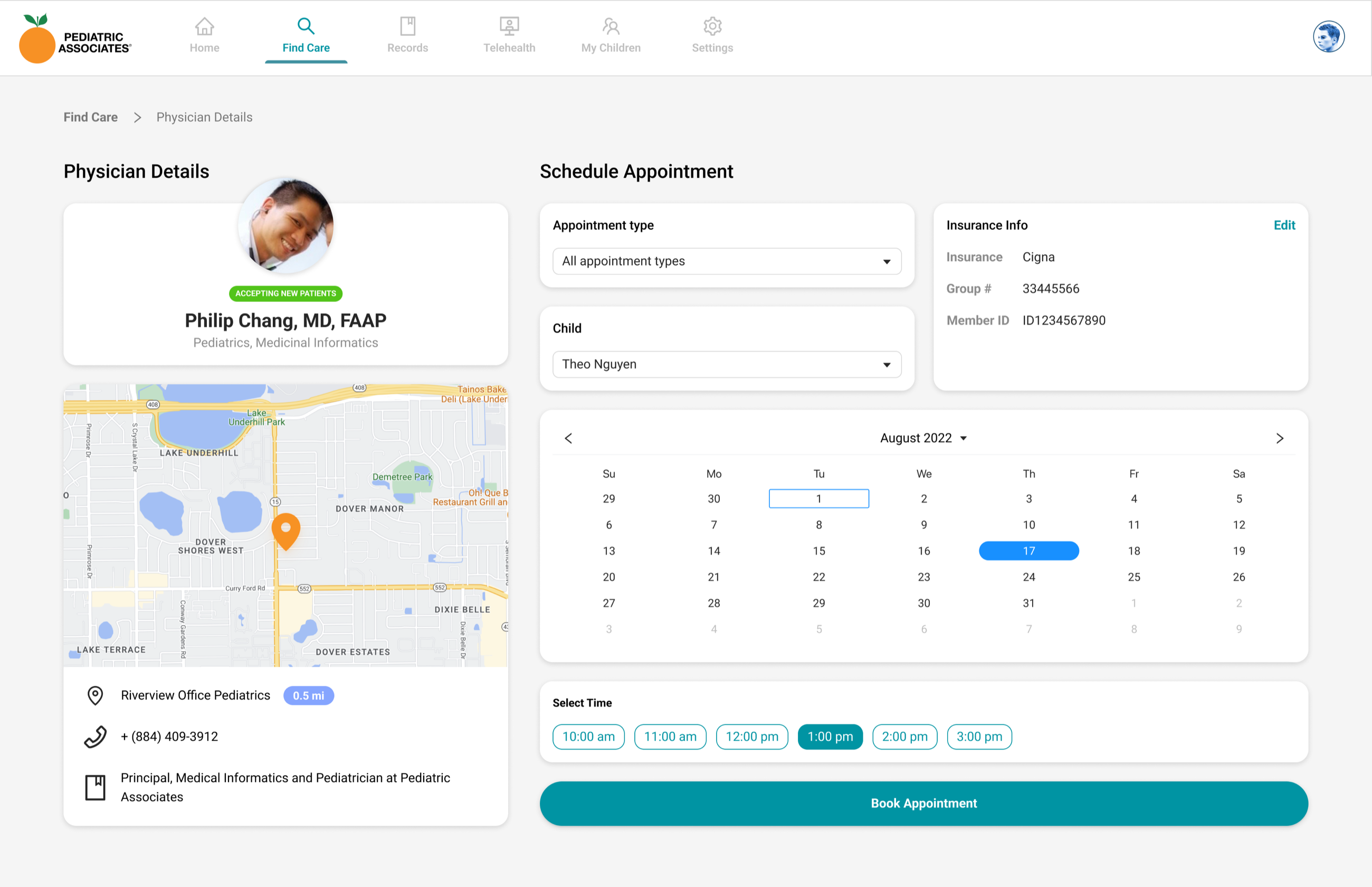
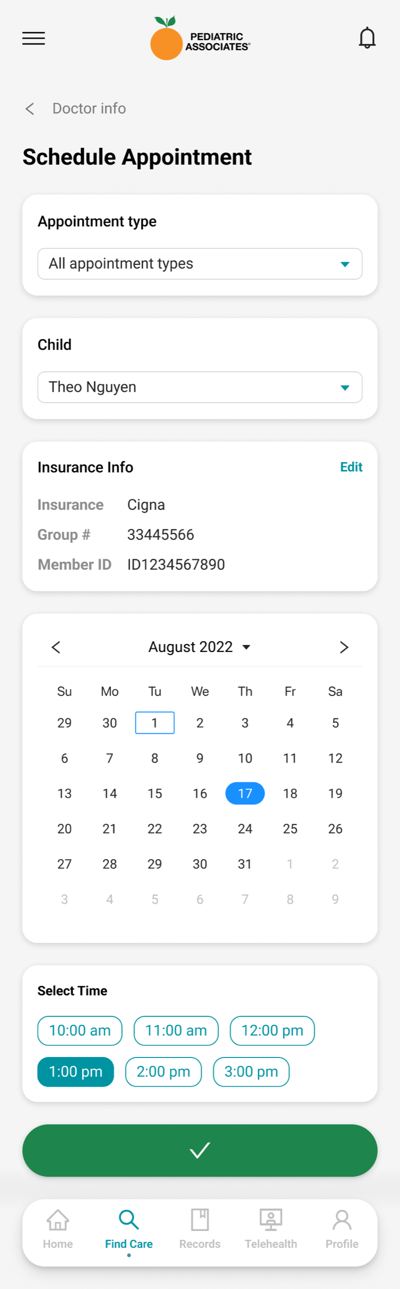
The booking page compresses the eight-minute phone script into one screen: pick the appointment type, pick the child, confirm the insurance already on file, then choose a date and time from real availability. No back-and-forth, no reading slots aloud, and the confirmation lands on the home page with calendar and directions actions attached.
Children as first-class citizens
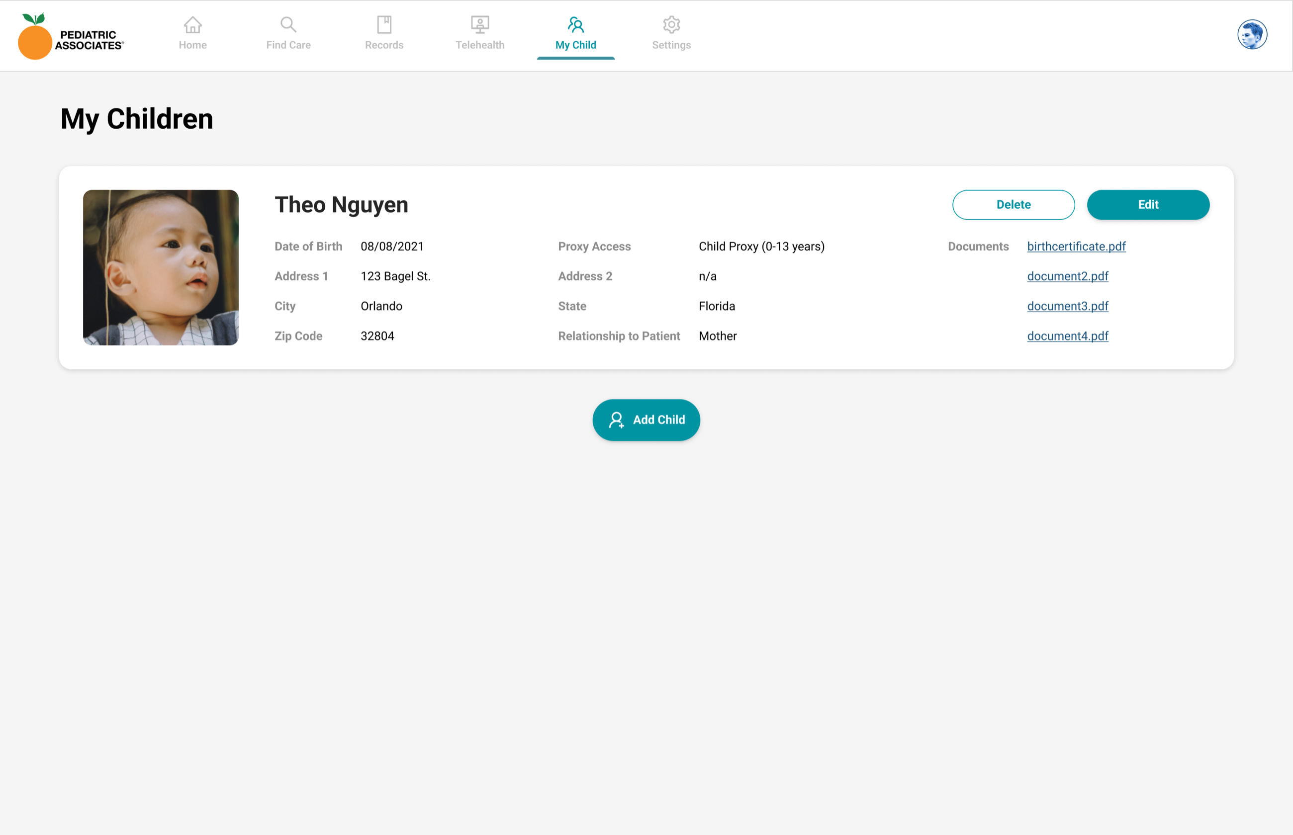
My Children makes the proxy model visible and manageable. Each child's profile carries their demographics, documents like birth certificates, and an explicit proxy access level that follows HIPAA age bands, so the portal can adjust what a parent sees as the child grows. Adding a child is a to-do on day one because every other flow depends on it.
The same journey in a pocket
Every flow shipped mobile-first alongside desktop. The phone experience keeps the same bones: symptom search, provider cards, and a booking screen that ends in a full-width confirmation.
Validation
Tested with parents, shipped in sprints
- Moderated usability testing with parents. Three rounds across the engagement, using realistic tasks like "book Theo a checkup with a doctor who takes new patients." Early rounds exposed friction in the insurance step, which moved from a form into confirmed-on-file information.
- Iteration inside the Agile delivery framework. As the consulting UX lead I worked ahead of the engineering sprints, so every flow arrived validated and annotated, and design debt never blocked a release.
- Measured against the blueprint. The service blueprint's eight-minute phone baseline gave us an honest benchmark: by the final round, parents booked in under three minutes with a 95% task success rate.
Impact
Scheduling moved out of the call center
The portal shipped across web and mobile with the family model at its core: proxy access, child-first appointments, and symptom-first search. Front offices got minutes back on every booking that moved online, and parents got the thing they actually asked for: care admin they can do at 9 PM.
Reflection
What I took away
- Model the household, not the user. The single most important design decision was structural: children as first-class objects with their own profiles and proxy rules. Every screen got simpler once the data model matched the family.
- Blueprints beat requirements documents. Mapping the phone call gave the team a shared, ordered list of what the portal had to answer. It also gave us the baseline that made the impact measurable.
- Consulting is design leadership on a clock. Working inside a client's Agile cadence taught me to validate ahead of the sprint line, so quality never became the reason a release slipped.