Context
An app store where every shelf looked different
ADP Marketplace sits between two audiences: HR buyers who need software that works with their payroll data, and hundreds of partner vendors who list, price, and sell that software. That multi-sided structure created the core UX problem. Every partner brought their own pricing model, their own copy, and their own idea of what a product page should be. Buyers comparing two apps were really comparing two different stores.
My mandate as design lead was to make the buying experience feel like one storefront: standardized commerce patterns, a mobile experience that could actually sell, and an experience bar (including accessibility) that partners had to meet rather than negotiate.
Workstream 1 · Pricing & Subscriptions
From pricing roulette to a comparison you can trust
The clearest symptom was the pricing page. Partners priced by employee bands, by seats, by modules, and often hid half their tiers inside a carousel. A buyer with 120 employees had to click through cards one at a time, do the math themselves, and hope the tier they needed existed on the next slide. Analytics showed pricing pages were the single biggest exit point in the funnel, and "how much does this actually cost" was a top support theme.
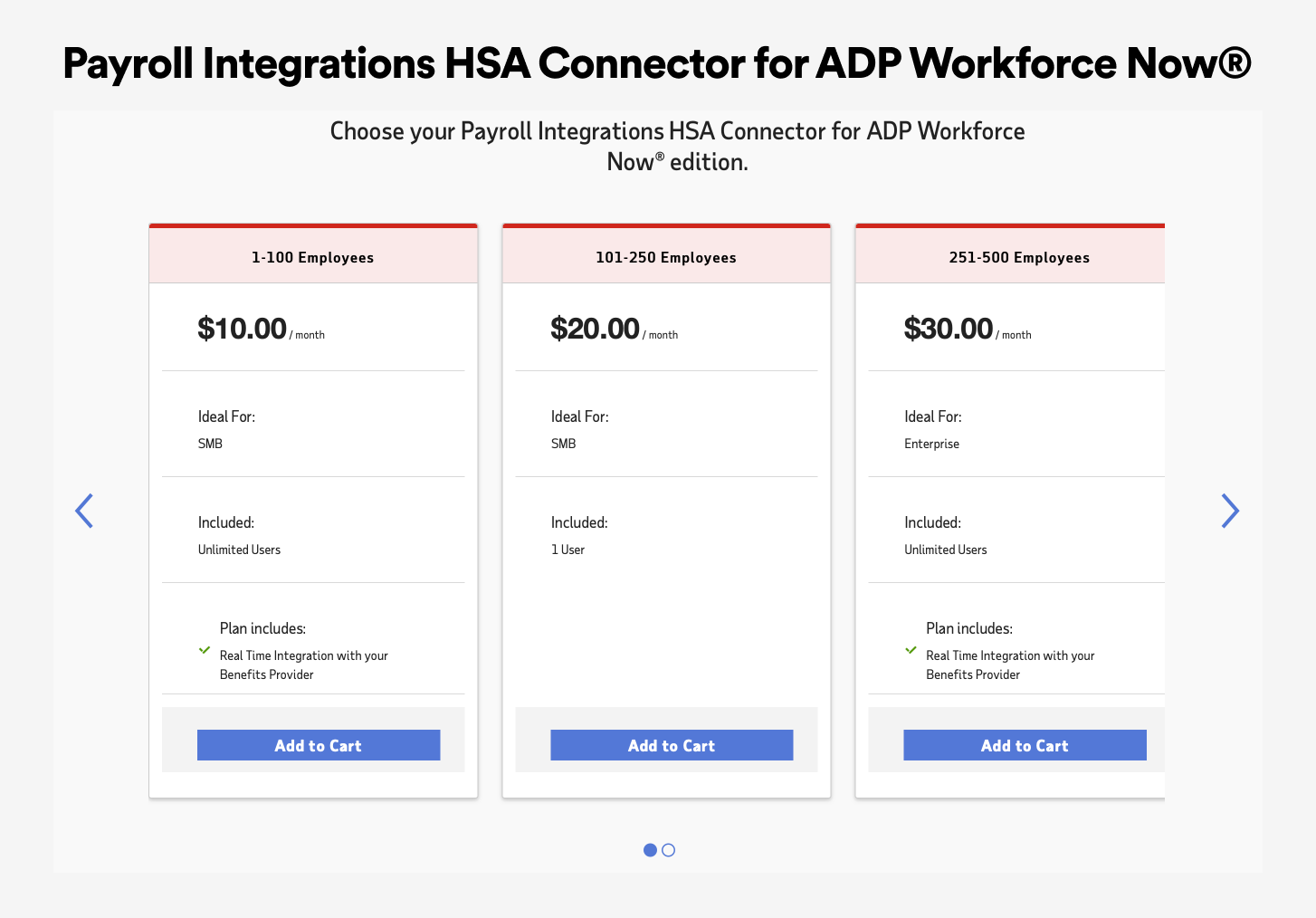
We replaced it with a standardized subscription template built around three moves:
- Show every plan at once. A flat comparison table with cumulative feature lists ("Everything from Standard, plus") replaced the carousel, so tradeoffs are scannable in one view.
- Do the math for the buyer. A team-size input recalculates each plan's monthly total in place. A 100-person company sees $700, not $7 per user and a homework assignment.
- Surface billing choices. A monthly and annual toggle and a "See pricing example" link put the details buyers asked support for directly on the page.
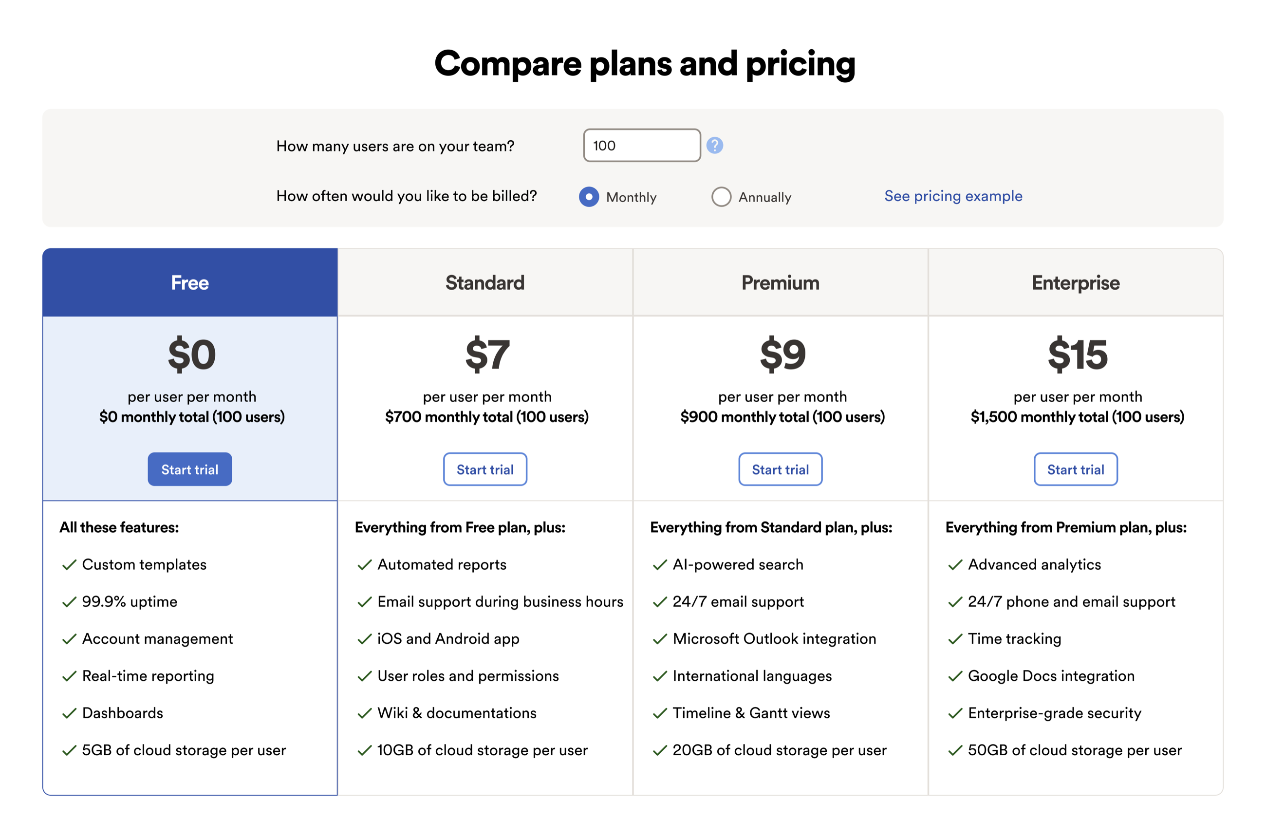
Because it shipped as a template rather than a one-off, partners adopted it listing by listing. Usability tests validated the calculator interaction before rollout, and A/B measurement after: trial starts rose 18% and pricing-page exits fell 22% on converted listings.
Workstream 2 · Mobile
A storefront that fits in a pocket
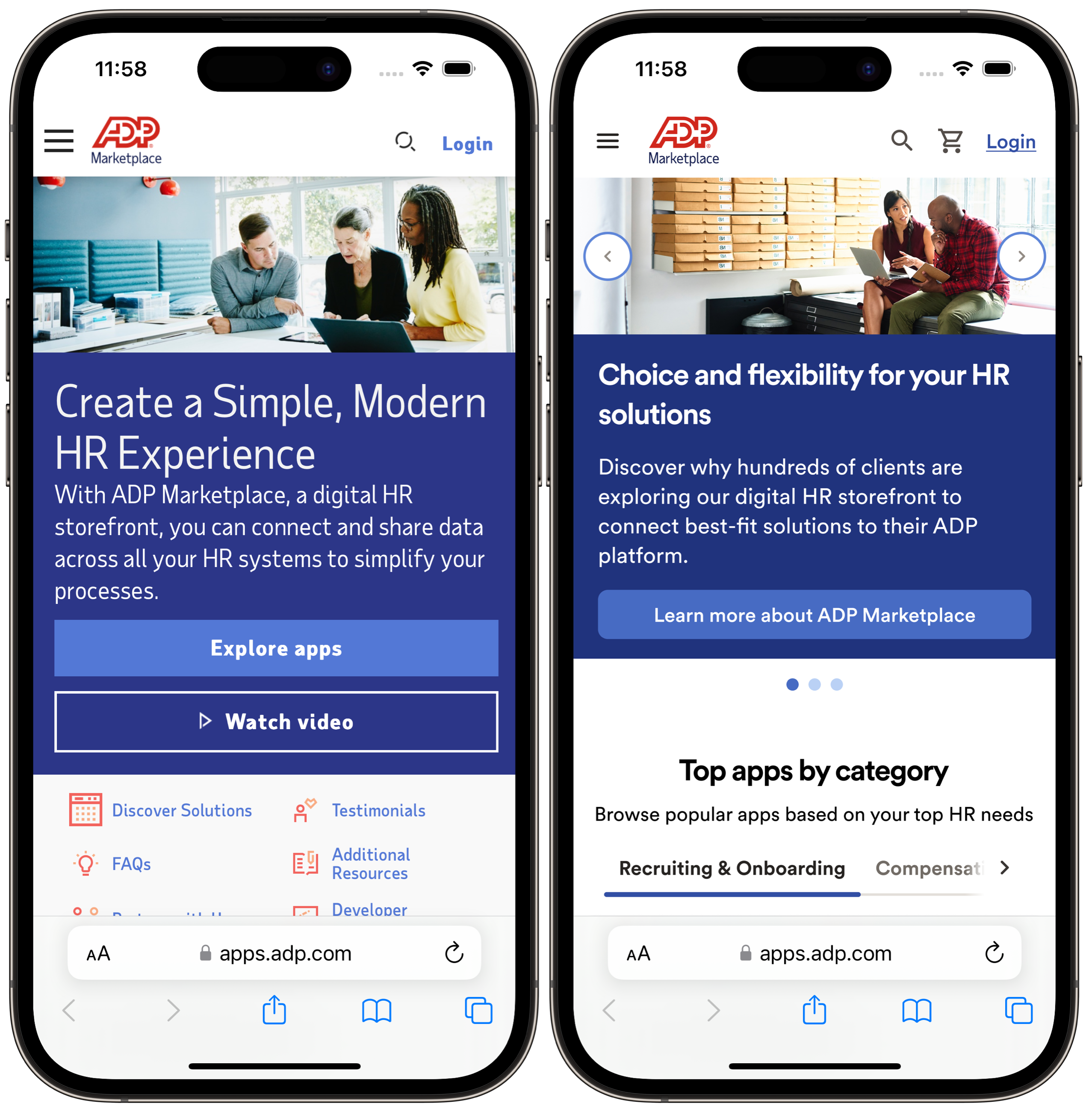
Over a third of Marketplace traffic arrived on phones, where the experience was a shrunken desktop. The home page led with brochure copy and a wall of quick links; finding an app category required a trip through desktop-style menus.
We rebuilt the mobile home page around shopping tasks. The hero keeps a single clear call to action, and the first scroll lands on "Top apps by category" with swipeable category tabs, putting real products one thumb-reach from arrival.
Navigation got the same treatment. The Marketplace taxonomy (solutions, industries, and partner types) collapsed into a three-level accordion that keeps context visible as you drill in, instead of teleporting between full-screen menus. Industry landing paths like Manufacturing resolve in two taps.
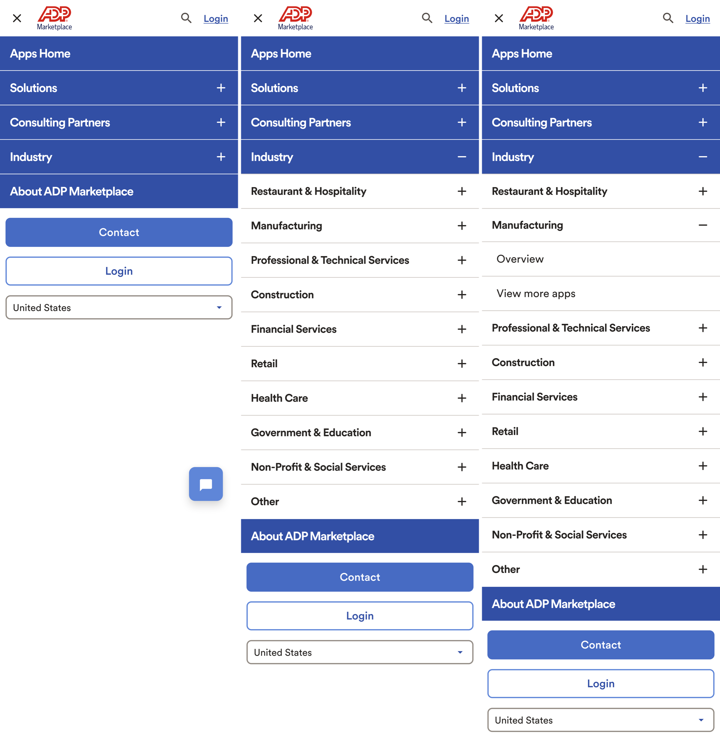
Category-page engagement from mobile home rose 31% after launch, and mobile bounce dropped double digits. More importantly, mobile stopped being a dead end for the funnel that pricing work was busy improving.
Workstream 3 · Accessibility
Auditing the keyboard path, screen by screen
An enterprise HR platform serves every employee, including the ones using keyboards and screen readers. Ahead of a compliance review, I ran a page-by-page keyboard audit of the buying journeys, annotating the actual tab order onto full-page screenshots so engineers could see the problem instead of parsing a spreadsheet.
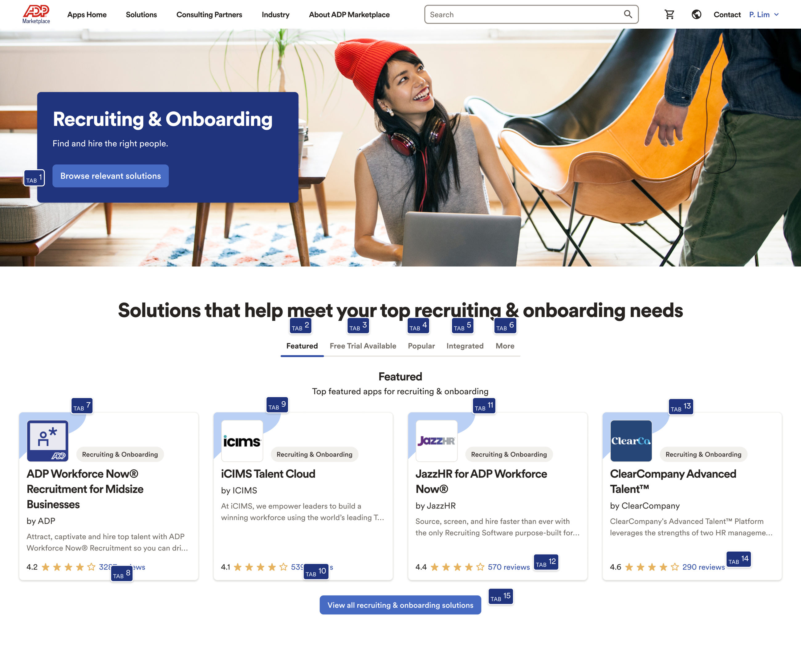
The audits drove a remediation backlog we worked through with engineering: logical focus order, visible focus states, correctly labeled interactive cards, and filter tabs that behave like tabs for assistive tech. Core buying journeys shipped fully keyboard operable and passed the WCAG 2.1 AA review on the first submission.
Impact
One storefront, measurably better at selling
Together the workstreams contributed to roughly $5M in annual marketplace revenue, and the pricing template became the default for new partner listings. The tab-order audit format outlived the project too: other ADP teams adopted annotated screenshots as their standard way to file accessibility findings.
Reflection
What I took away
- Templates scale taste. In a multi-sided marketplace you cannot redesign every partner's page. Designing the constraint (a template partners want to adopt) moves the whole catalog at once.
- Do the arithmetic for people. The single highest-impact element across the project was a number input that multiplied price by team size. Buyers do not want pricing models; they want their total.
- Make audits visual. Engineers fixed tab order in days once the finding was a numbered overlay on their own page instead of a row in a compliance tracker.