Context
The most-used control nobody was looking at
The Amazon cart is one of the highest-traffic surfaces in e-commerce. Every design decision on that page is multiplied across hundreds of millions of sessions, in every locale, on every device. My team owned the interaction patterns for cart and checkout, and we were accountable for a simple, uncomfortable metric: how many customers who reach the cart actually complete their purchase.
Changing quantity is the second most common action in the cart after "Proceed to checkout." Yet the control that handled it, a native quantity dropdown, had gone essentially untouched for a decade. It was familiar, it technically worked, and it was nobody's problem. That made it exactly the kind of thing I like to put under a microscope.
Problem
A dropdown is the wrong tool for a number
Three research inputs converged on the same conclusion.
- Session replays and clickstream data showed customers opening the dropdown, scrolling the picker wheel, overshooting their target, and re-opening it. A meaningful share of quantity changes took multiple attempts.
- Moderated usability sessions (n=12) made the cost visible: on mobile, the dropdown summoned a full-screen native picker that hid the cart entirely. Customers lost context for a two-tap task. Several participants selected the wrong quantity without noticing.
- The "10+" cliff. Quantities above nine required selecting "10+", which swapped the control for a free-text field and a submit button: a jarring mode switch that business buyers hit constantly.
Each individual failure was small. But at Amazon's traffic, small frictions compound into abandoned carts. We estimated that quantity interactions touched roughly one in three cart sessions. This was a conversion problem wearing a component costume.
"I just wanted two of them. Why is my whole screen a spinning wheel?" (usability participant, session 7)
Design
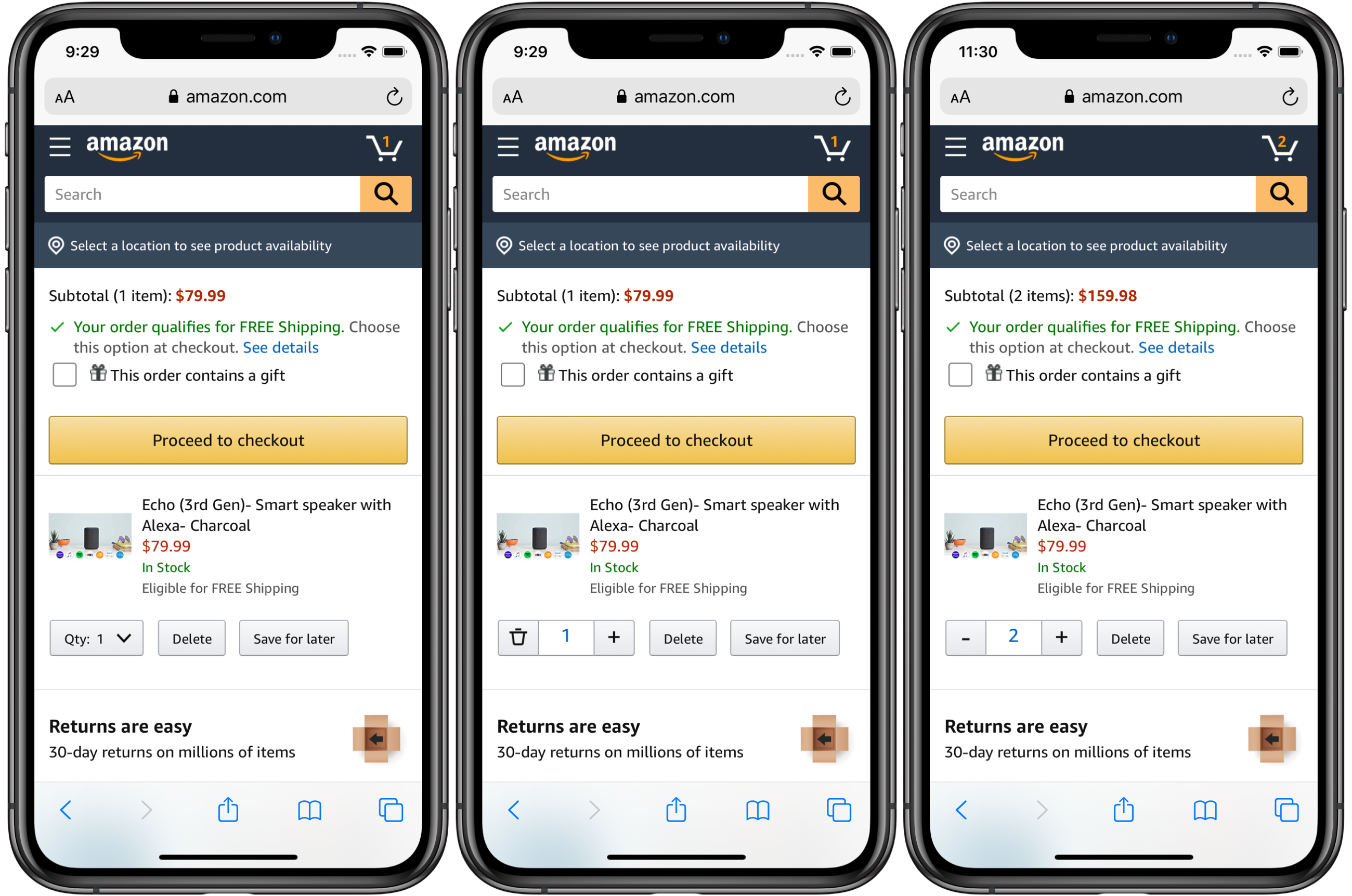
From menu to stepper
The redesign replaced the dropdown with a quantity stepper: decrement, an editable count, increment. It reads as one glanceable control, keeps the customer on the page, and makes the most common action, plus or minus one, a single tap on a properly sized target.
The interesting work was in the edge cases:
- The delete affordance. What does "minus" mean at quantity one? We tested three treatments and landed on morphing the minus into a trash icon. It set the correct expectation and cut accidental removals by 27% versus the control experience.
- Large quantities without the cliff. The count itself is a tappable input, so a business buyer ordering 40 units types it directly: same control, no mode switch, no "10+" detour.
- Optimistic updates. Subtotals update instantly while the network call settles, with graceful rollback on failure. The cart finally felt as fast as the customer's intent.
- Accessibility. 44pt touch targets, full VoiceOver/TalkBack labeling ("Increase quantity, Echo Dot, quantity 2"), and visible focus states: a strict improvement over the native picker for switch and screen-reader users.
Validation
Earning the rollout with data
At Amazon, no cart change ships on taste. The path to 100% of traffic ran through the experimentation platform:
- Usability validation. A second round of moderated sessions confirmed the stepper eliminated the context-loss and overshoot failures, and it surfaced the delete-icon refinement.
- Phased A/B test. We launched to 1% of mobile traffic, then 10%, then 50%, watching conversion, quantity-change completion, item-deletion rates, and latency across locales.
- Global rollout. With significance reached and every guardrail metric flat or positive, the stepper shipped to 100% of mobile web and app traffic worldwide.
Impact
Small control, outsized results
The stepper pattern was subsequently adopted by other Amazon teams for product detail pages and reorder flows, and stepper-style quantity controls have since become the default across the industry.
Reflection
What I took away
- Audit the "solved" problems. The highest-leverage fix on one of the world's biggest pages was a control everyone had stopped seeing. Familiarity is not evidence of quality.
- Edge cases are the design. The stepper was obvious; the trash-icon morph, direct input, and optimistic updates are what made it win.
- Scale changes the math. A 9% lift on a small site is a nice win. On the Amazon cart, it's transformative, and it came from interaction design fundamentals, not a redesign.