Context
One platform, hundreds of banks, zero tolerance for mistakes
Fiserv builds the banking software that other institutions put their own name on. The same platform surfaces as a community bank's website and a credit union's app, which means design flaws do not ship to one audience, they ship to all of them at once. The regulatory floor is equally unforgiving: WCAG and ADA accessibility, FDIC disclosures, and security requirements that shape even a password field.
When I joined as Lead UX Designer, implementations had drifted. Error states were improvised screen by screen, masked inputs behaved differently across products, and accessibility was verified at the end instead of designed at the start. The fix was structural: a design system where the correct, compliant, error-resistant behavior is the only behavior a component has.
Foundations
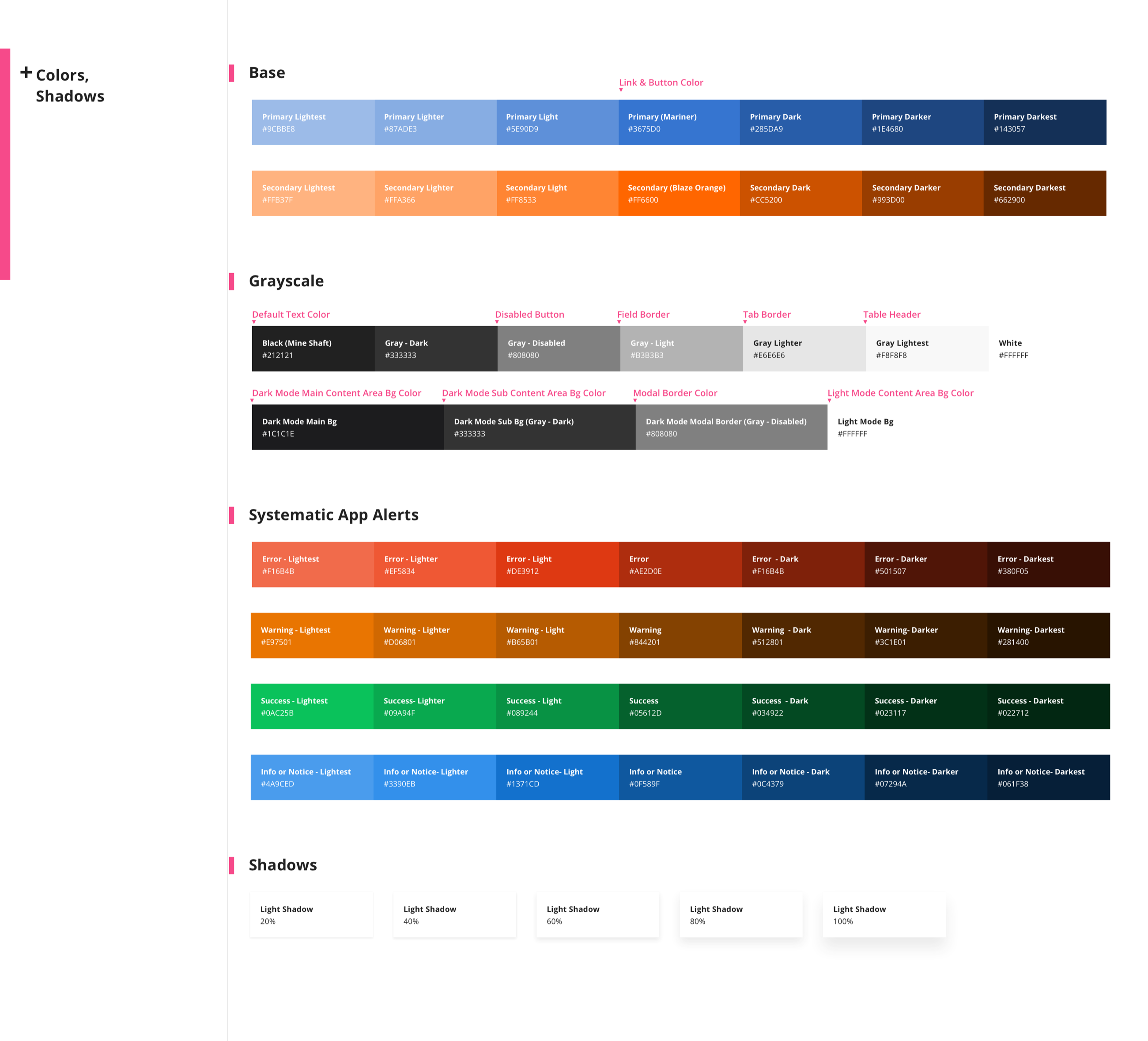
A color system with the rules built in
The foundation layer binds usage to the palette itself. Every ramp is annotated with what it is for (link and button color, default text, disabled states, field borders, table headers), dark mode tokens are first-class, and the alert system carries full seven-step ramps for error, warning, success, and info so that every state has an accessible contrast pairing at any elevation. Compliance stopped being a review step because it was encoded in the swatches.
Validation Patterns
Specifying the moment things go wrong
The resume version of this work is one line: research-informed validation patterns. The actual work was exhaustive. Banking forms are full of high-stakes masked inputs (Social Security numbers, account numbers, routing numbers) where the user cannot even see what they typed. We specified every permutation: mask hidden and visible, label positions, error, focus, and error-focus states, with the message placement standardized so screen readers and sighted users get the same story at the same moment.
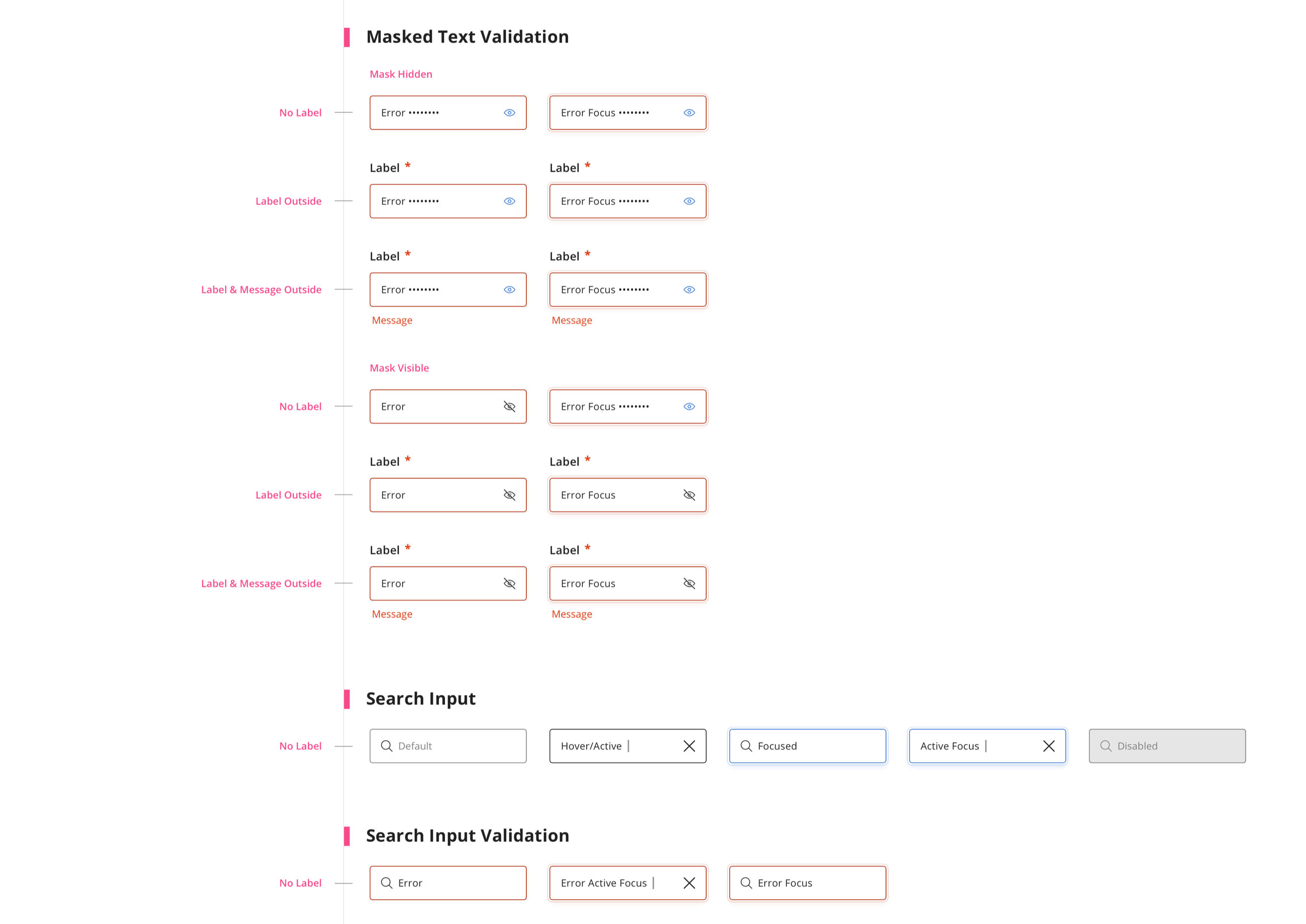
The same rigor covered date pickers, dropdowns, text areas, and search. Twenty-two pattern families in all, each documented to the level where engineering and compliance could implement without interpretation.
Workflows
Where prevention beats correction
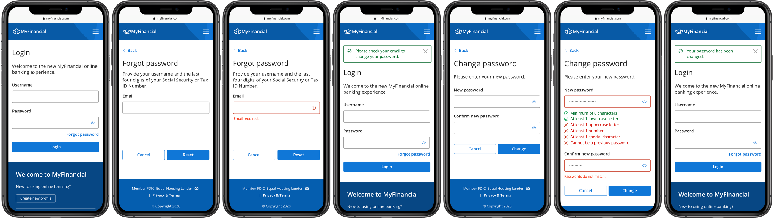
The system proved itself on the platform's most error-prone journey: authentication. The redesigned password recovery flow guides instead of gatekeeping. Requirements appear as a live checklist that checks off as the user types, mismatches are flagged inline before submission, and every state change is confirmed in plain language. Nobody discovers the rules by failing them.
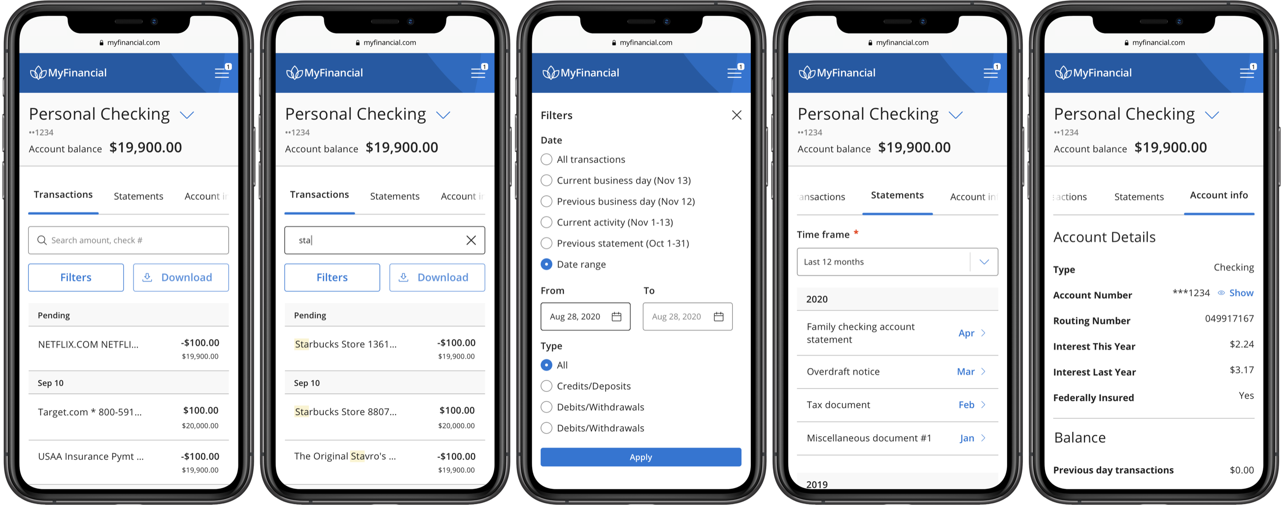
Everyday banking got the same treatment. The personal checking experience pairs search with highlighted matches, plain-language filters, and an account info panel where sensitive numbers stay masked until deliberately revealed. Safe defaults, reversible choices, no surprises.
Validation
Tested against real mistakes
- Error-focused usability testing. Rounds of moderated sessions targeted the failure points analytics flagged: password recovery, masked field entry, and transaction search. We measured error commission, not just task completion.
- Compliance as a design partner. Working sessions with Engineering and Compliance turned regulatory requirements into component specs up front, instead of redlines after the fact.
- Iterated in production. Error-rate telemetry on shipped flows confirmed the lab findings and caught the stragglers, feeding the next revision of the pattern library.
Impact
Fewer mistakes, calmer support lines
Error rates fell 25% across the redesigned workflows as validation moved from punishing mistakes to preventing them. The pattern library became the default for new client implementations, which meant every improvement compounded: fix a state once, and forty institutions ship the fix.
Reflection
What I took away
- Design the failure states first. Happy paths are easy. The character of a financial product lives in what happens when someone types their routing number wrong, and specifying those moments is where the error-rate wins came from.
- Compliance is a design material. Treating WCAG and regulatory constraints as inputs to the system, rather than a gate at the end, made the work faster and the outcome stronger.
- White-label multiplies craft. On a platform other companies rebrand, one well-specified component improves hundreds of products you will never see. It is the quietest kind of scale.