The challenge
Amazon's checkout handles billions of dollars in transactions every year. Even a fraction of a percent improvement in conversion translates to enormous revenue. But making things better at that scale is hard. Every change touches millions of people, so getting it wrong is expensive.
When I joined the checkout team in 2015, the core flow had grown organically over years. Different teams had added steps, edge cases, and variations that made the experience feel patched together. First-time buyers struggled. Mobile users dropped off. And the team had limited visibility into exactly where and why.
The real challenge wasn't building something new. It was making careful, evidence-based improvements to something that already worked for most people, without breaking it for anyone.
My approach
Start with data, confirm with humans
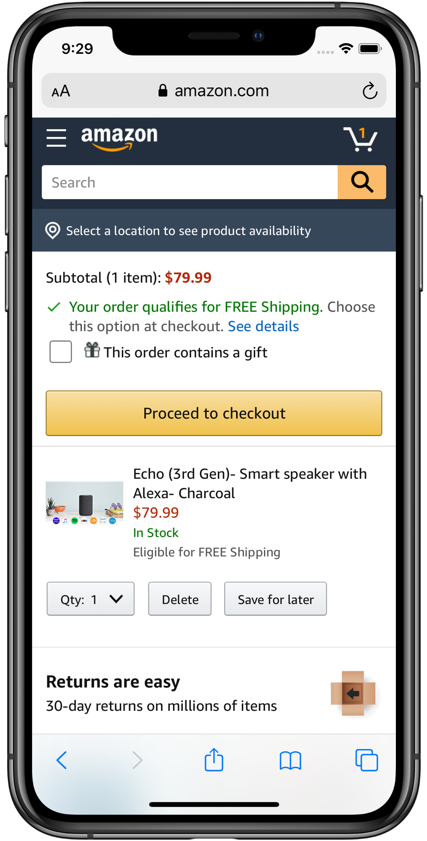
I worked closely with analytics to identify the steps where customers were most likely to abandon. Funnel analysis showed us that the address confirmation step had a surprisingly high drop-off rate: around 12% of customers who reached it didn't continue. That was our first priority.
We ran moderated usability sessions with customers who had recently abandoned checkout. The sessions revealed something the data couldn't: customers weren't confused about what to do. They were hesitant. They didn't trust that their saved address was correct, especially after a move or a long gap between purchases. They were second-guessing, not lost.
Design the fix around the real problem
We redesigned the address confirmation step to clearly show when an address was last used and make editing feel lightweight and reversible. We surfaced address details more prominently instead of collapsing them behind "view details" links. And we added a simple confirmation nudge ("Is this still correct?") rather than assuming the default was always right.
The redesign reduced drop-off on that step by 20%. Across the volume of traffic Amazon sees, that's a significant number of orders that would otherwise have been abandoned.

Build a culture of experimentation
One of my biggest contributions was establishing a consistent experimentation framework for the design team. Before, designers would propose changes and push them through engineering. I introduced a structured process where every significant UX change was shipped as an A/B test first, with clear success metrics defined before launch.
This made the team more confident in their decisions and more credible with stakeholders. When a test showed a 3–5% lift in conversion, we had the data to back it up. Not just a designer's opinion.
Improve the mobile experience
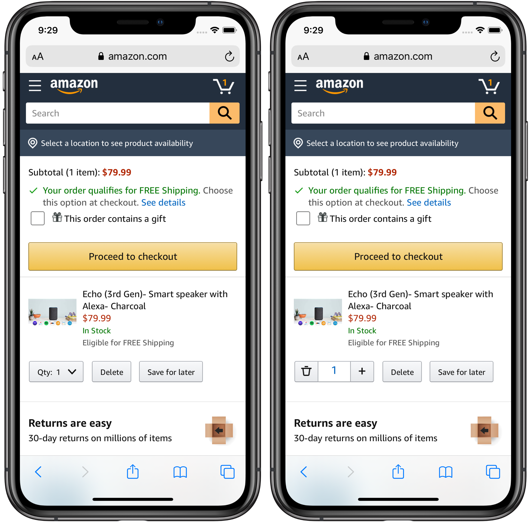
Mobile checkout was growing rapidly but the experience hadn't been designed mobile-first. We ran a targeted mobile usability study and found several issues: tap targets were too small, the payment section required too much scrolling, and error messages were easy to miss.
We shipped a mobile-specific payment layout that reduced the number of taps required to complete a purchase by 4 steps. Combined with larger interactive targets and inline error messaging, mobile conversion improved meaningfully in follow-up testing.
Leading the team
Over five years I built out the checkout UX team from a small group into a well-functioning design function. I hired five designers, established design review practices, and introduced a shared component library that made it easier for designers to prototype quickly without reinventing the wheel.
I also worked hard to keep designers connected to actual customers. I required every designer on my team to observe at least two usability sessions per quarter, not just watch recordings, but actually be in the room (or on the call). That practice consistently produced better design decisions than relying on secondhand research summaries.
The best outcome of my time at Amazon wasn't any single design. It was building a team that could keep improving the experience long after I was gone.
Results
What I learned
Designing at Amazon's scale teaches you humility. The thing you're most proud of might be a 2% lift that nobody outside your team will ever celebrate publicly. But you know the math, and you know it matters.
It also taught me the value of combining quantitative and qualitative research. Analytics tells you where the problem is. Usability testing tells you why. You need both to design the right solution.
Finally, I learned that the most durable UX improvements come from building teams and processes that are good at getting better, not from any individual hero project.