The challenge
The ADP App Marketplace had all the pieces of a great product: a large user base, a growing catalog of integrations, and a business case that made sense. What it lacked was a coherent experience that connected all those pieces for the people who had to use it every day.
There were two very different types of users to design for: HR professionals who needed to find, evaluate, and subscribe to third-party apps without a technical background, and software developers who needed tools to list, manage, and monitor their apps on the platform. These groups had almost nothing in common in terms of how they thought about the product, but both had to be served well for the marketplace to succeed.
The marketplace wasn't failing. But it wasn't meeting its potential either. Customers said discovery felt overwhelming. Developers said the listing tools were opaque. Both sides felt like the platform wasn't designed with them in mind.
Understanding both sides of the marketplace
Research with HR customers
I ran a series of moderated sessions with HR professionals at companies of varying sizes. The finding that surprised us most: users weren't struggling to find apps. They were struggling to trust them. The marketplace had hundreds of listings, but the pages didn't give customers enough information to feel confident in a subscription decision. Reviews were thin. Screenshots were generic. Pricing structures were confusing.
Customers were doing external research (Googling reviews, asking on HR forums) before committing to anything. That meant we were losing people to friction that we could fix inside the product.
Research with developer partners
Developer interviews told a different story. Partners said the listing creation process took too long and required too much back-and-forth with ADP's internal team. They didn't understand how their apps were performing, because metrics were buried in reports that required interpretation. And when something was wrong with their listing, they often found out from customers rather than from the platform.
Developers wanted self-service tools that gave them control and visibility. Right now, they felt dependent on ADP staff for things that should be automatic.
What I built
Redesigned app discovery and listing pages
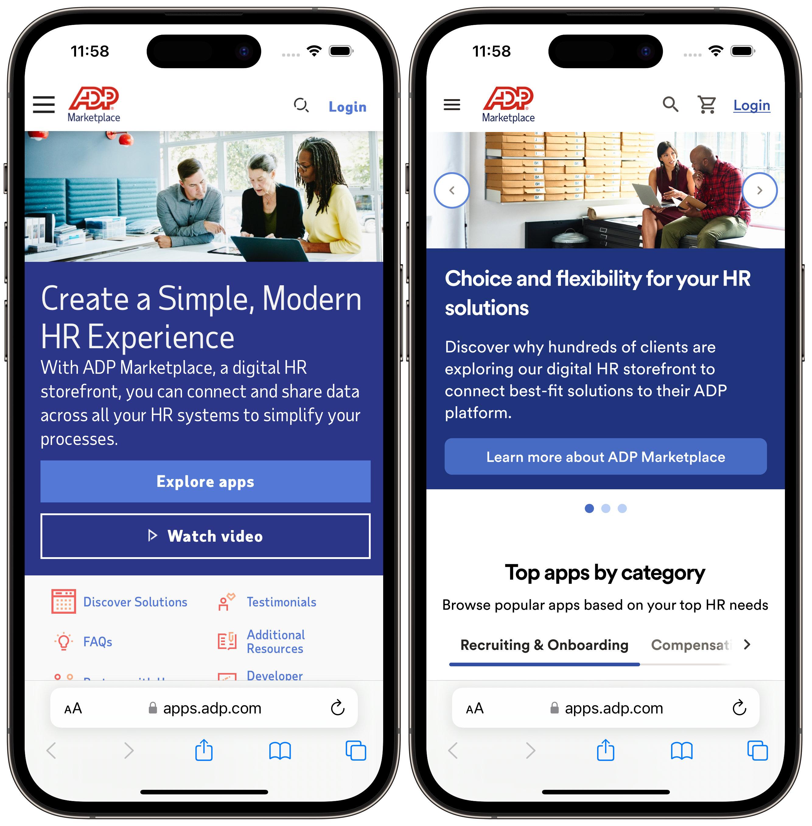
We restructured app listing pages around the questions customers actually had: What does this app do? How does it connect to ADP? How much does it cost and how am I billed? What do other HR teams say about it? What happens after I subscribe?
We introduced a standardized information architecture for every listing. Not just suggested guidelines, but enforced fields that every developer had to complete before their app could go live. This raised the floor on listing quality across the entire catalog without requiring manual review of every page.
Improved onboarding flow
Subscription completion was lower than it should have been. After watching several users go through the process, we identified the issue: the connection step (where users actually link their ADP account to the third-party app) felt technically intimidating and lacked clear progress cues.
We redesigned the onboarding as a step-by-step guided flow with plain-language explanations at each stage, inline help text, and a clear indication of where users were in the process. Post-launch, support tickets related to onboarding dropped by 30% within the first quarter.
Developer dashboard and analytics
For developer partners, we designed a self-service dashboard that gave them visibility into what mattered: install counts, subscription trends, review scores, and flagged issues that needed attention. We also built a listing editor that let developers update their app pages directly, without waiting for an ADP internal review, for routine changes like screenshots, descriptions, and pricing updates.
Partners who used the new dashboard reported feeling more invested in the platform, and ADP's internal team saw a measurable reduction in listing-related support requests from developers.
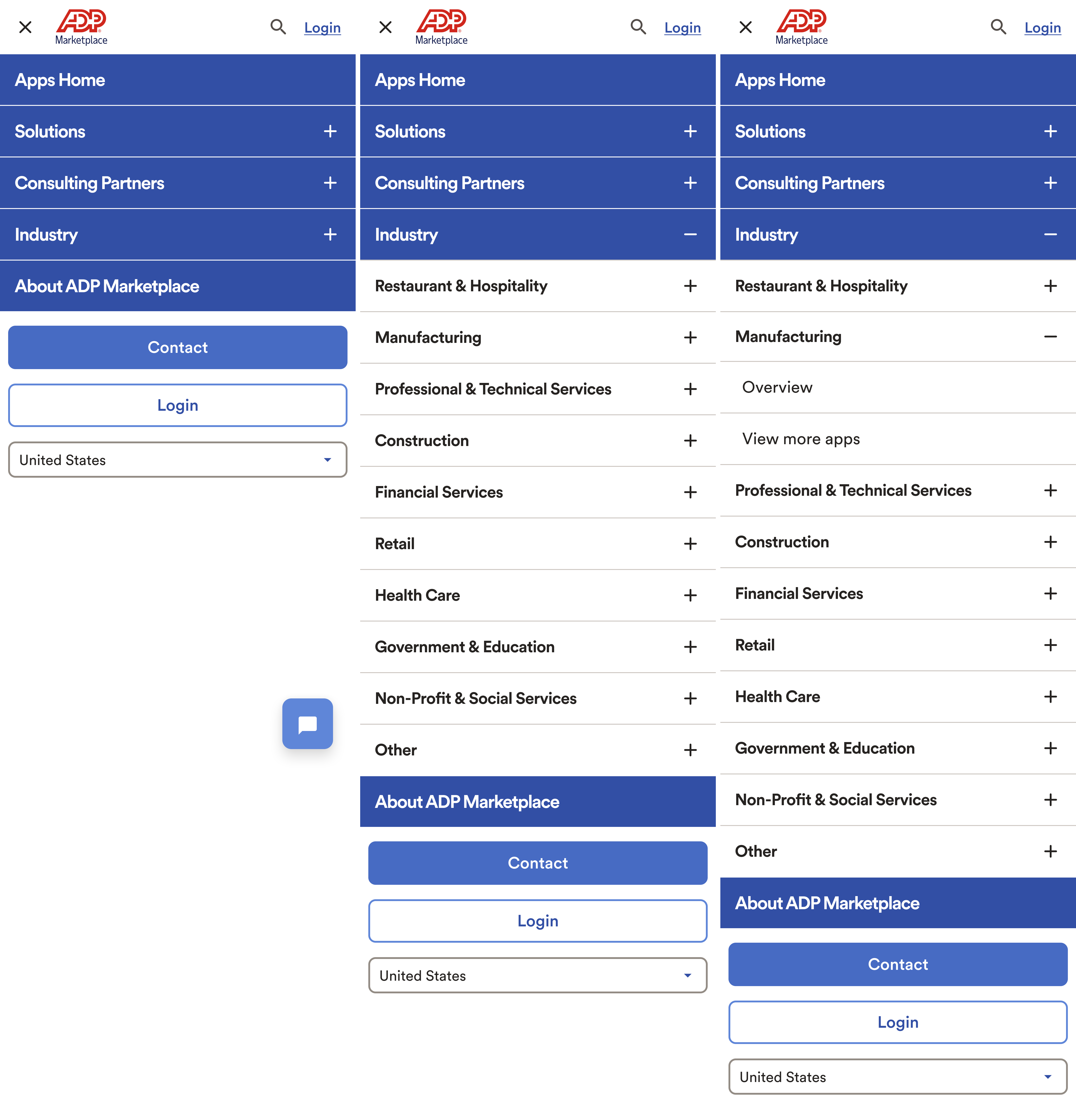
Mobile navigation
Mobile navigation was one of the more complex problems on the marketplace. The site had a large catalog organized by solutions, industry, and consulting partners — all of which needed to be accessible from a compact mobile menu. We designed a multi-level accordion navigation that let users drill into categories without losing context, with clear expand and collapse controls at each level.
Subscription management
HR admins often needed to manage app subscriptions on behalf of their team, including adding users, adjusting plans, or canceling when a contract ended. This had been a painful, support-heavy process. We designed a subscription management center where admins could see all active subscriptions in one place, make changes in a few clicks, and get a clear invoice history without needing to contact anyone.
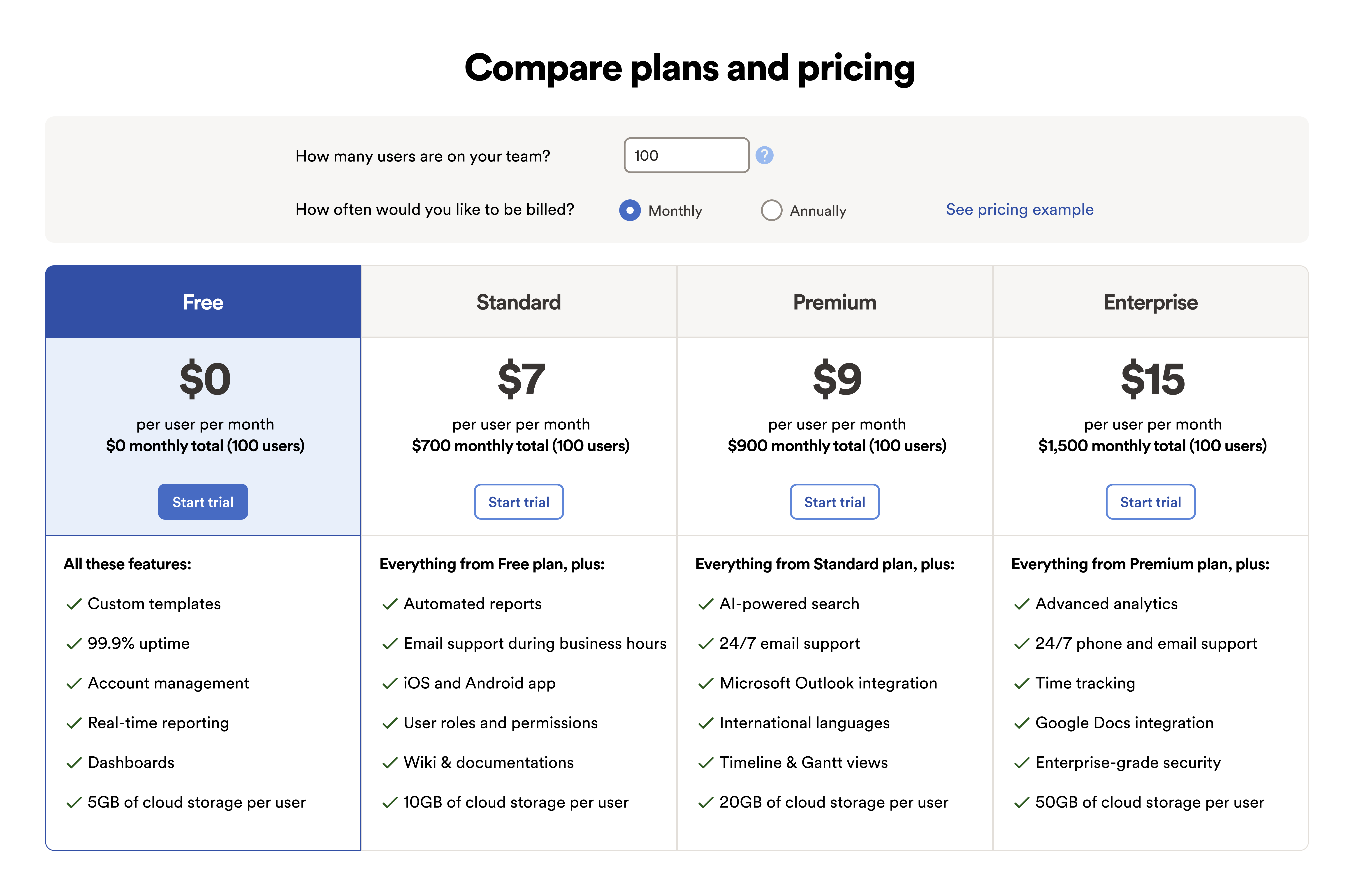
Pricing redesign
The original pricing experience used a carousel of tier cards that showed inconsistent information between plans and required users to swipe to compare options. Customers frequently contacted support just to understand what they were buying before committing.
We redesigned it as a side-by-side comparison table with a built-in pricing calculator. Users could enter their team size and choose monthly or annual billing, and the table would update totals in real time. The feature list for each tier was standardized so every plan showed the same attributes, making comparison fast and honest.
How I worked
I was the sole lead UX designer for the marketplace, which meant I was responsible for the full design lifecycle, from research facilitation to final Figma files for engineering handoff. I worked in two-week agile sprints alongside the Product and Engineering team, participating in planning, review, and retrospective ceremonies.
One practice I established early: a monthly design review with the product leadership team where I would present in-progress work and research findings. This kept stakeholders informed and created a reliable channel for early feedback before work reached engineering, which meant far fewer late-stage revisions.
Designing a multi-sided marketplace means every decision you make for one user type has downstream effects on the other. I kept both sides visible throughout every design review and planning session so we never accidentally optimized for one at the expense of the other.
Accessibility
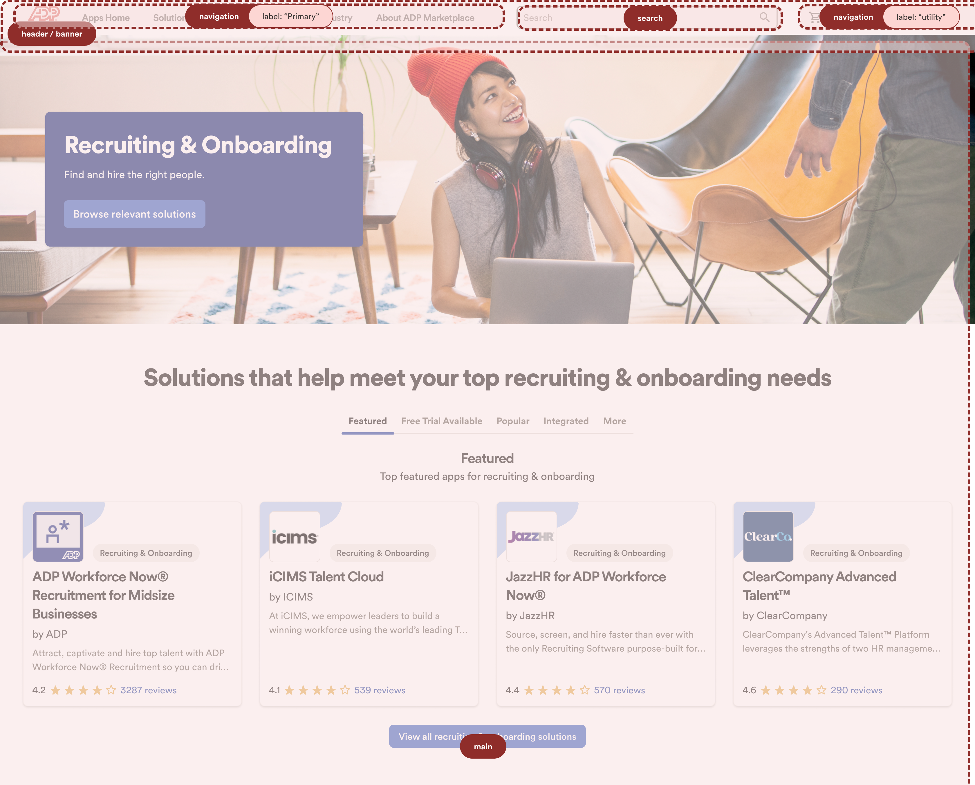
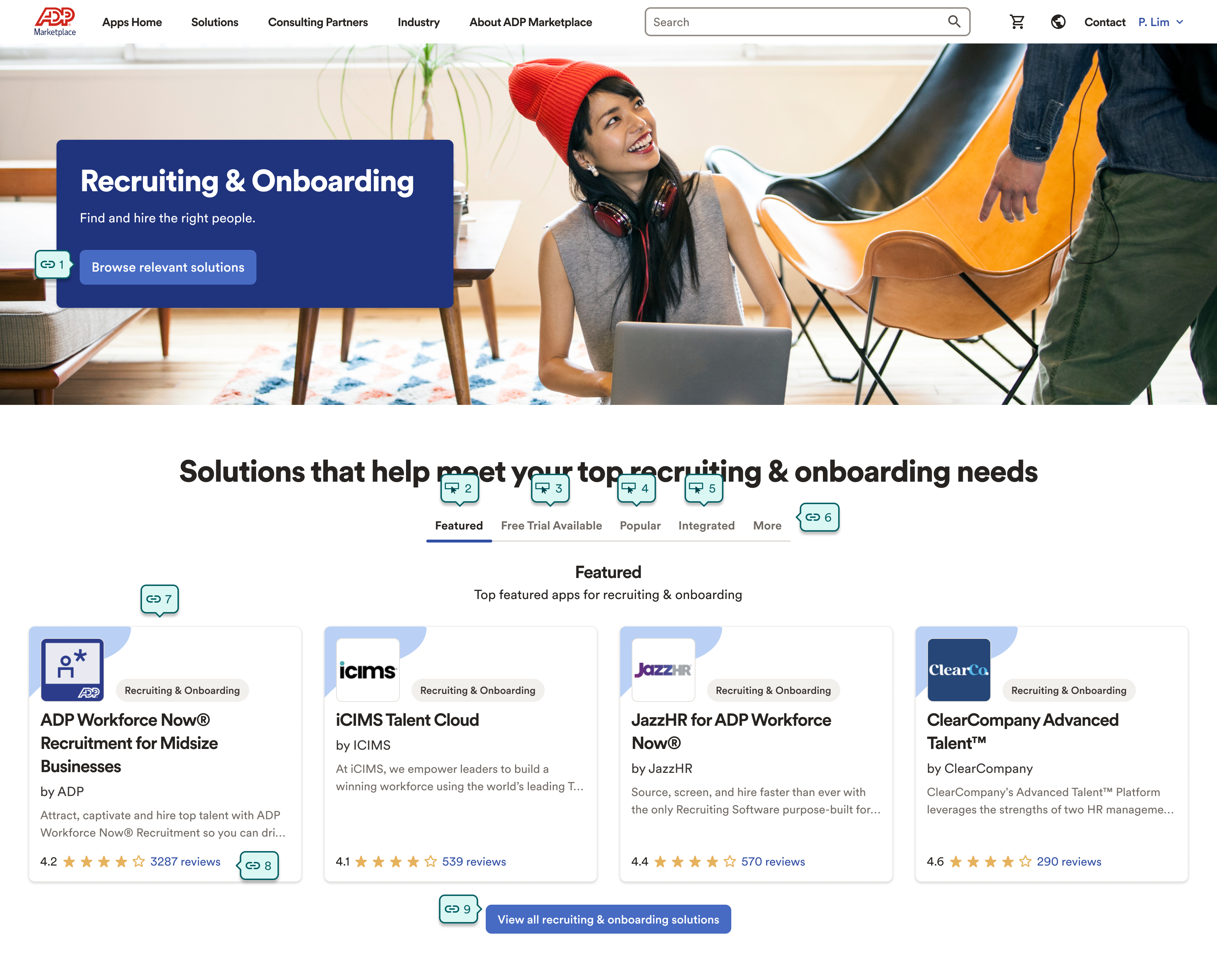
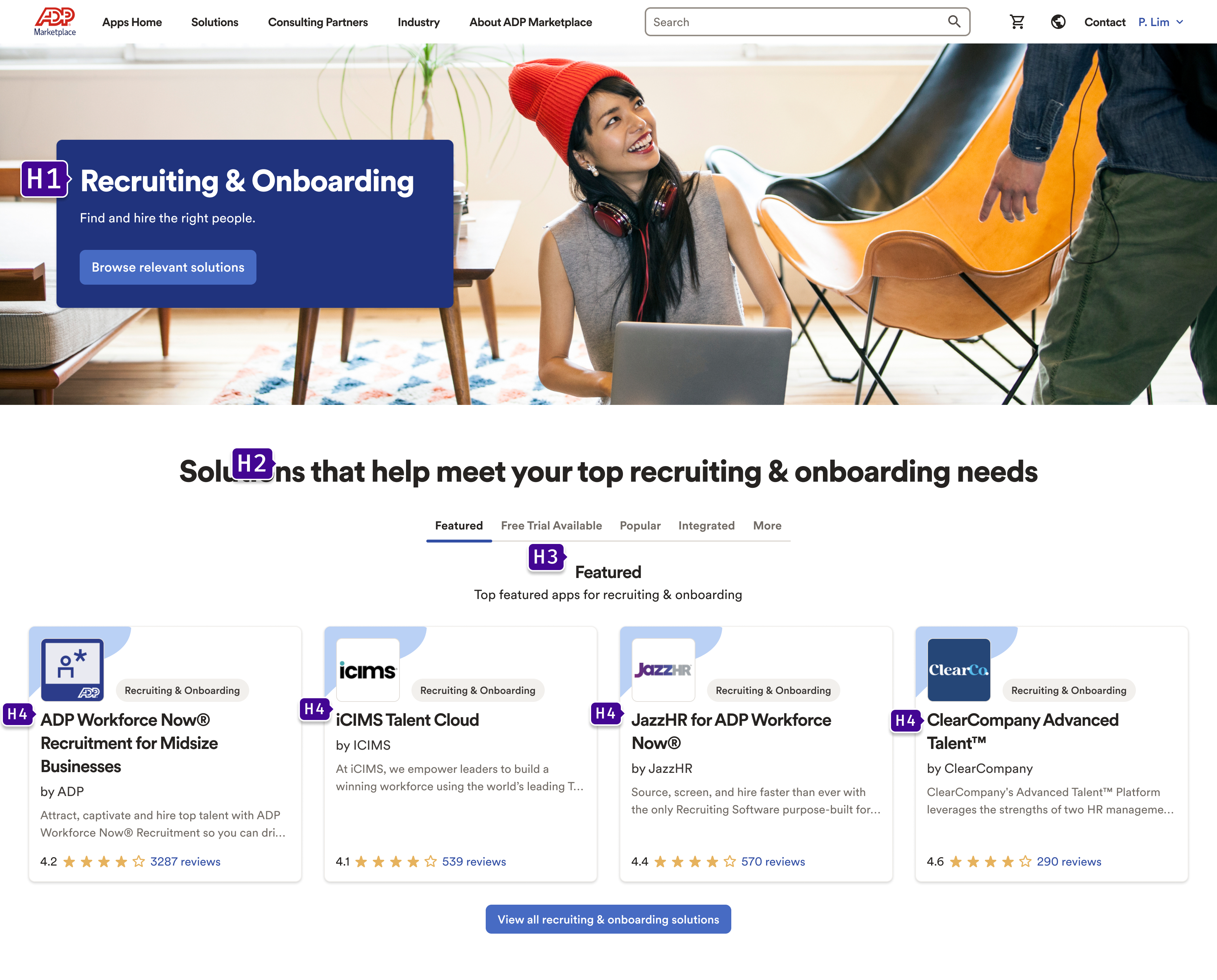
Accessibility was a deliberate part of the design process, not an afterthought. I conducted structured audits of key pages to evaluate landmark regions, tab order, and heading hierarchy — three of the most common sources of failure for keyboard and screen reader users.
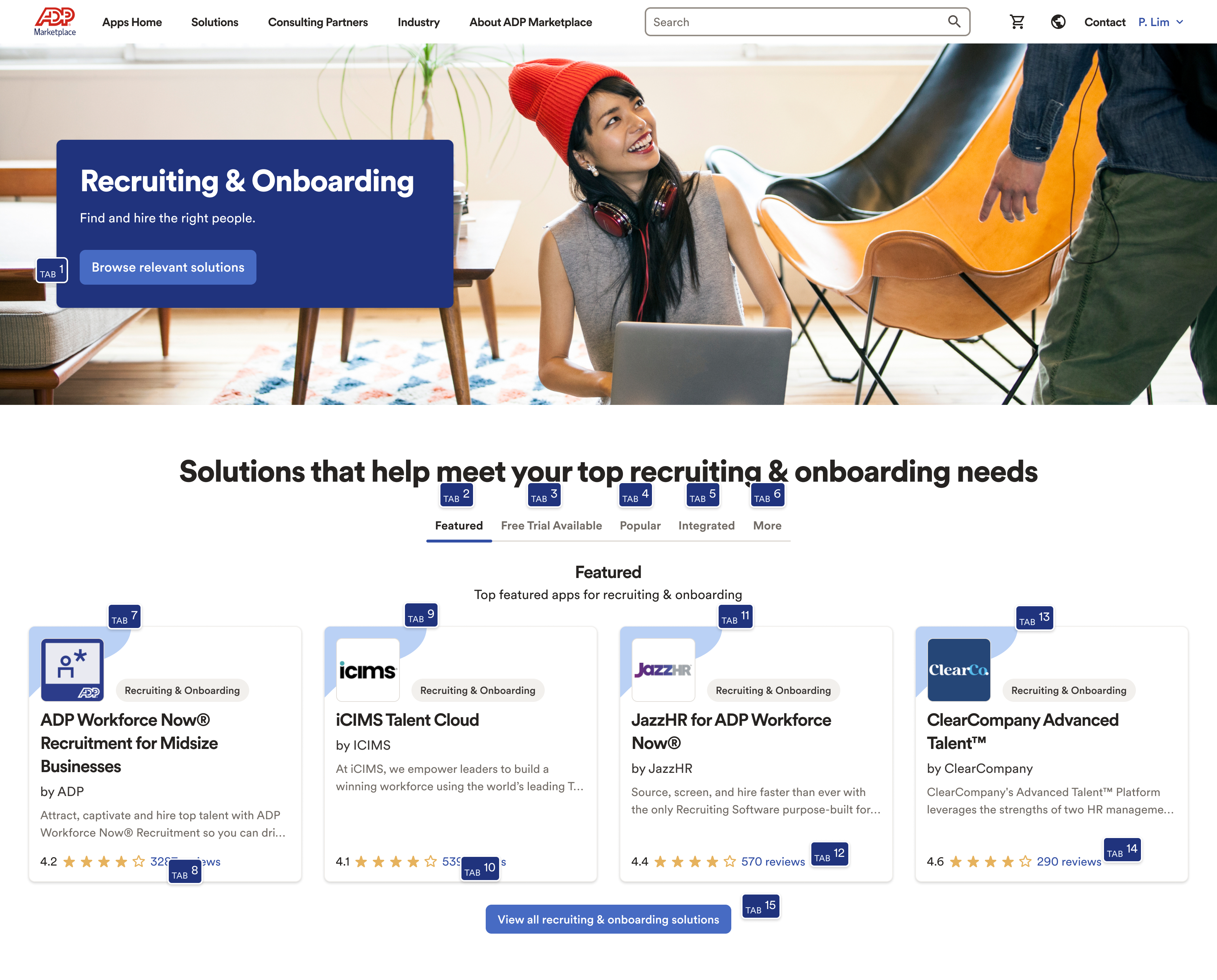
The Recruiting & Onboarding category page is shown below at each stage of the audit. We used the findings to fix navigation landmarks, repair broken tab sequences, and establish a consistent heading structure across the catalog.

Results
What I learned
Multi-sided marketplaces are one of the most interesting design problems in software. Every feature you touch has two stakeholders with different, and sometimes competing, needs. The discipline is in staying intentional about which side you're prioritizing in any given decision, and making sure that's a choice rather than an accident.
I also learned how much quality floor-setting matters at scale. Enforcing structured listing requirements had a bigger impact on the average customer experience than any individual UI improvement. When you have hundreds of listings, the architecture of what you require matters as much as what you design.