The challenge
Clinical software is a unique design environment. The people using the product aren't software users by trade. They're dentists, dental assistants, and front-desk staff who are focused on patients, not screens. Every second a clinician spends navigating the software is a second they're not spending on patient care.
Dentsply Sirona's platforms had accumulated years of features and workflows. Navigation was inconsistent across modules. The same task could be completed in multiple places, which confused users who weren't power users. Role differences were handled inconsistently: a dentist needs different things than a front-desk scheduler, but the platform treated them the same. People saw options they didn't need and missed options they did.
The evidence was in the support queue: the customer support team was fielding a steady stream of navigation-related tickets that pointed directly to usability issues rather than technical bugs.
When dental professionals are calling support to ask "where do I find X?", that's a navigation problem, not a training problem. The product should answer that question on its own.
Research: Understanding how dental teams actually work
Contextual observation
To understand the real usage patterns, I arranged observational sessions with dental practice staff. We watched how they moved through the software during an actual workday, in the context of a real practice managing appointments, clinical records, and billing simultaneously.
What we saw was striking. Staff were using the same few features constantly and ignoring large portions of the interface. They had developed workarounds for things that should have been straightforward. One front-desk coordinator had created a sticky-note guide for herself just to remember where certain settings were located.
Support ticket analysis
I worked with the customer support team to analyze six months of tickets and categorize them by type. About 22% fell into a category we labeled "navigation confusion," meaning users couldn't find something or weren't sure they were in the right place. Another 15% were "unexpected behavior," where the software did something the user didn't predict, usually because a workflow step was non-obvious.
Together, those two categories accounted for more than a third of support volume. Both were directly addressable through UX improvements.
Role-based workflow mapping
We mapped the full set of tasks each role performed (dentists, dental assistants, and front-desk staff) and cross-referenced them with the current navigation structure. We found significant mismatch: the navigation grouped features by system module, not by job role. Dentists frequently had to navigate into sections that were primarily administrative. Front-desk staff saw clinical tools they had no reason to access.
What I redesigned
Home page redesign
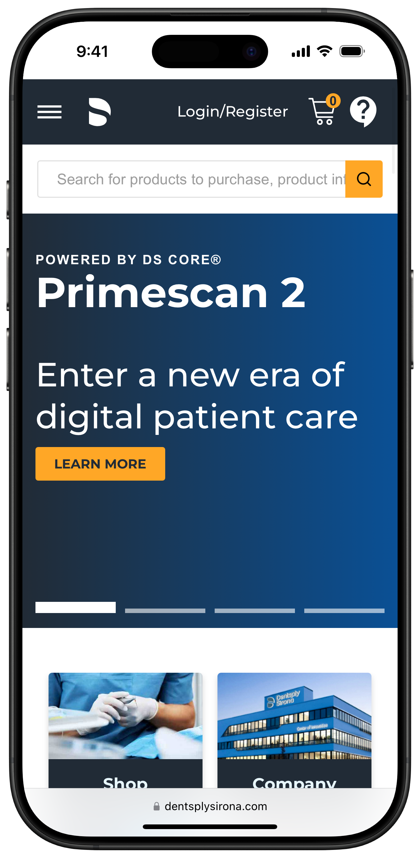
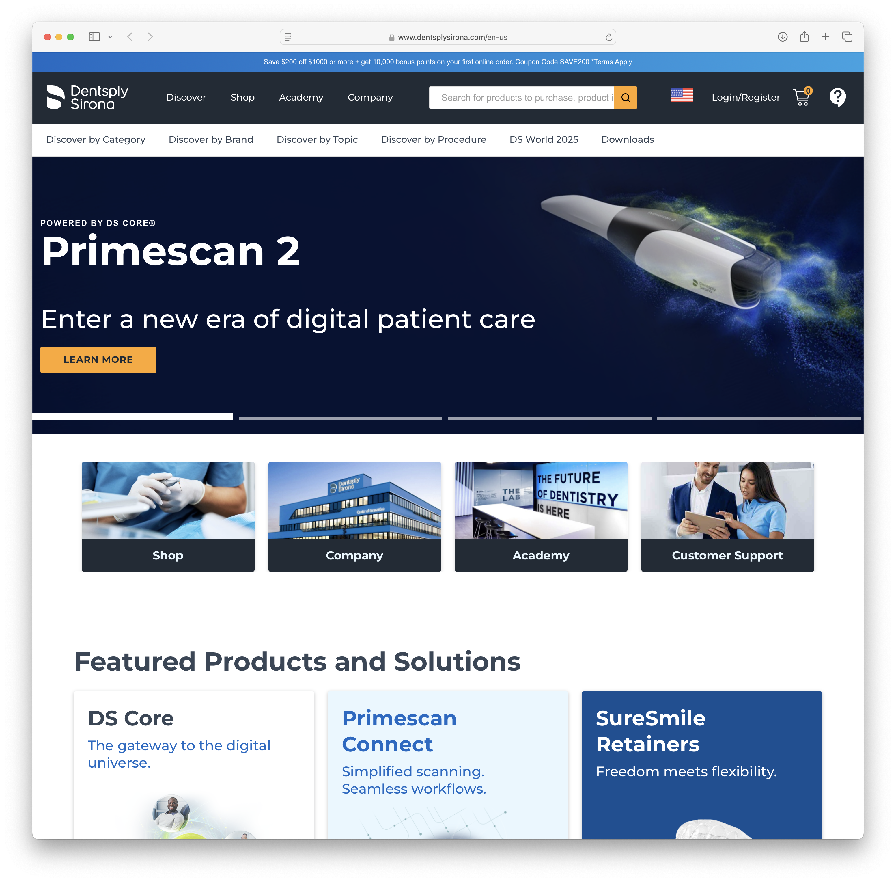
The original home page led with a product promotion for Primescan 2, burying the site's actual value proposition behind a feature carousel. First-time visitors had no clear sense of what Dentsply Sirona's platform could do for their practice. The navigation was cluttered with utility links, a search bar, and login controls all competing for attention.
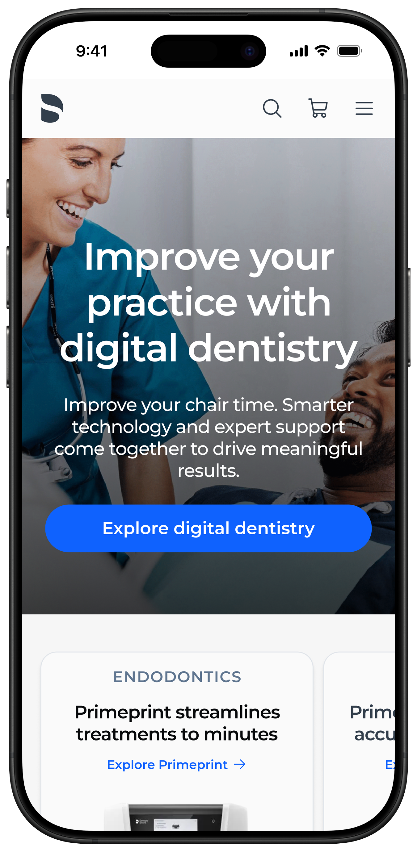
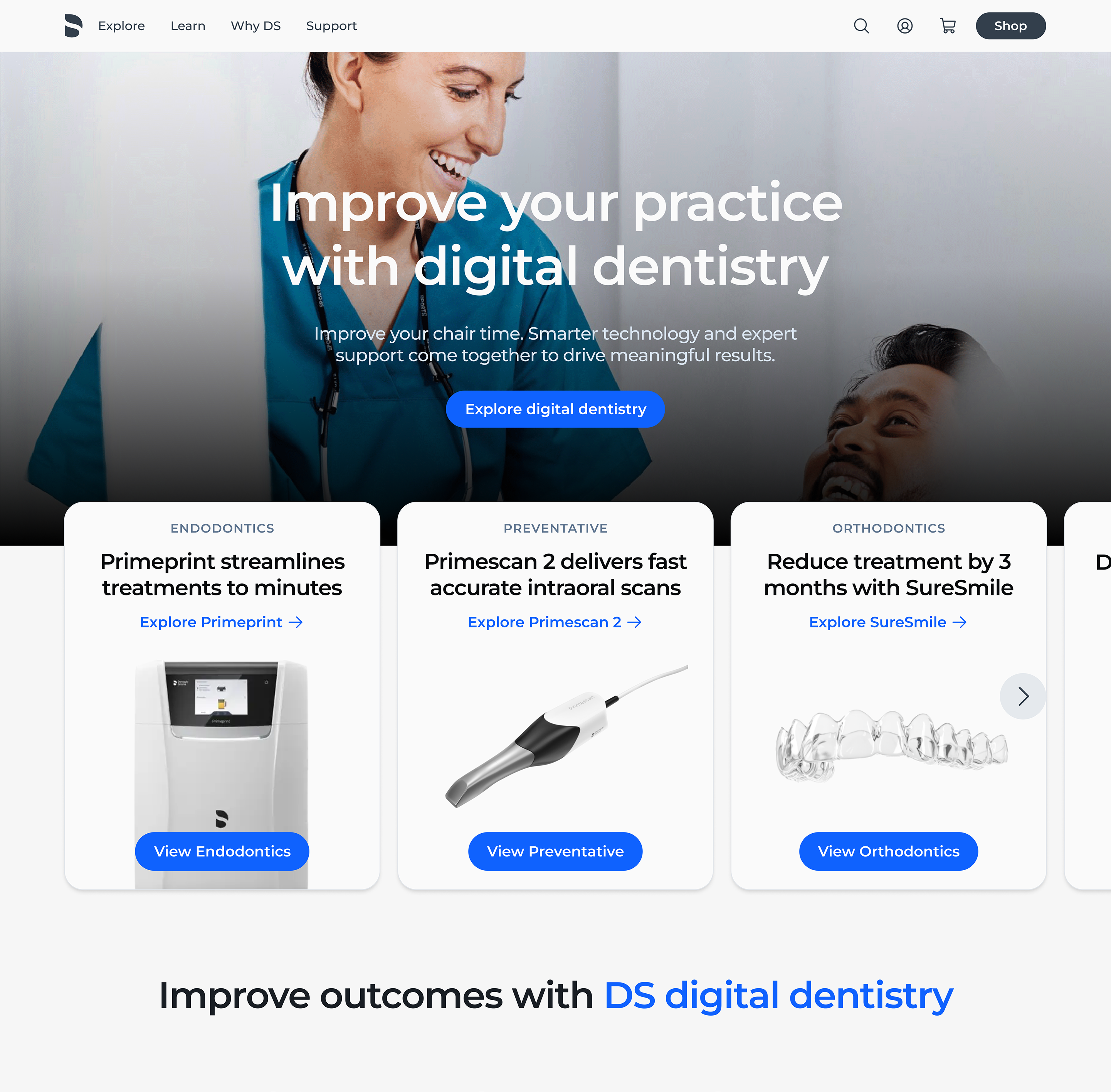
The redesigned home page leads with a full-bleed hero image and a single clear message: what the platform does and why it matters to dental professionals. The navigation was simplified and the hierarchy cleaned up so users immediately understood where to go next.
Simplified global navigation
The core navigation was restructured around tasks rather than modules. Instead of organizing by system section ("Scheduling," "Records," "Billing"), we reorganized around the primary workflows each role performed. The items a dentist saw in their navigation were different from what a front-desk coordinator saw, not because we built two separate products, but because we personalized the experience based on their role.
This eliminated a significant amount of visual noise. Users saw fewer options, but they were the right options. In post-launch usability sessions, time-to-task on common workflows dropped noticeably. Users weren't hunting anymore.
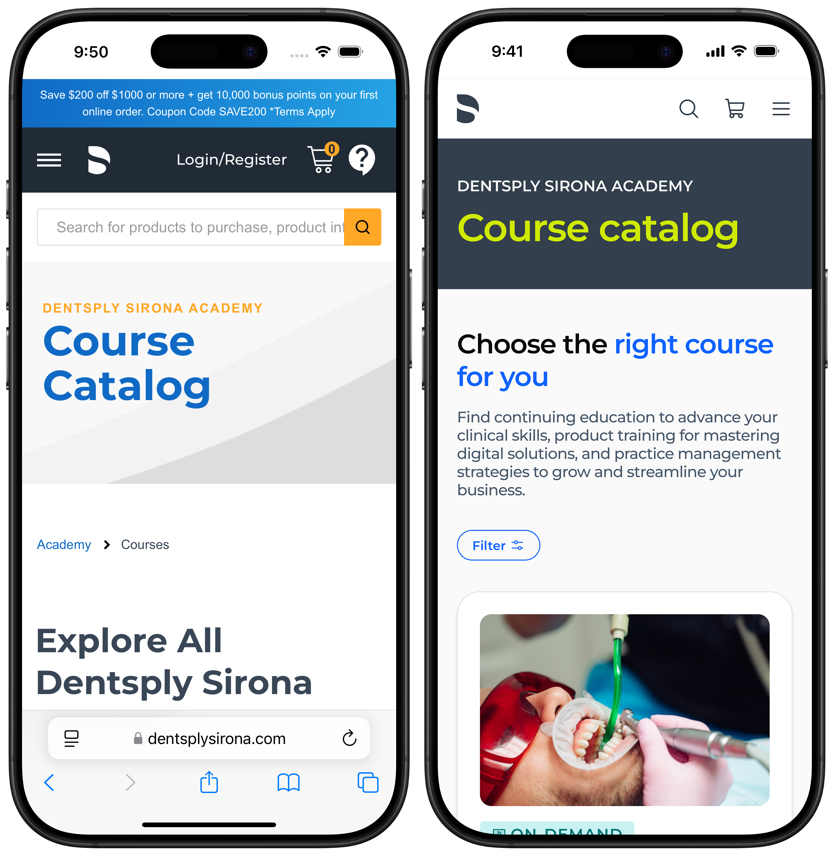
Course catalog
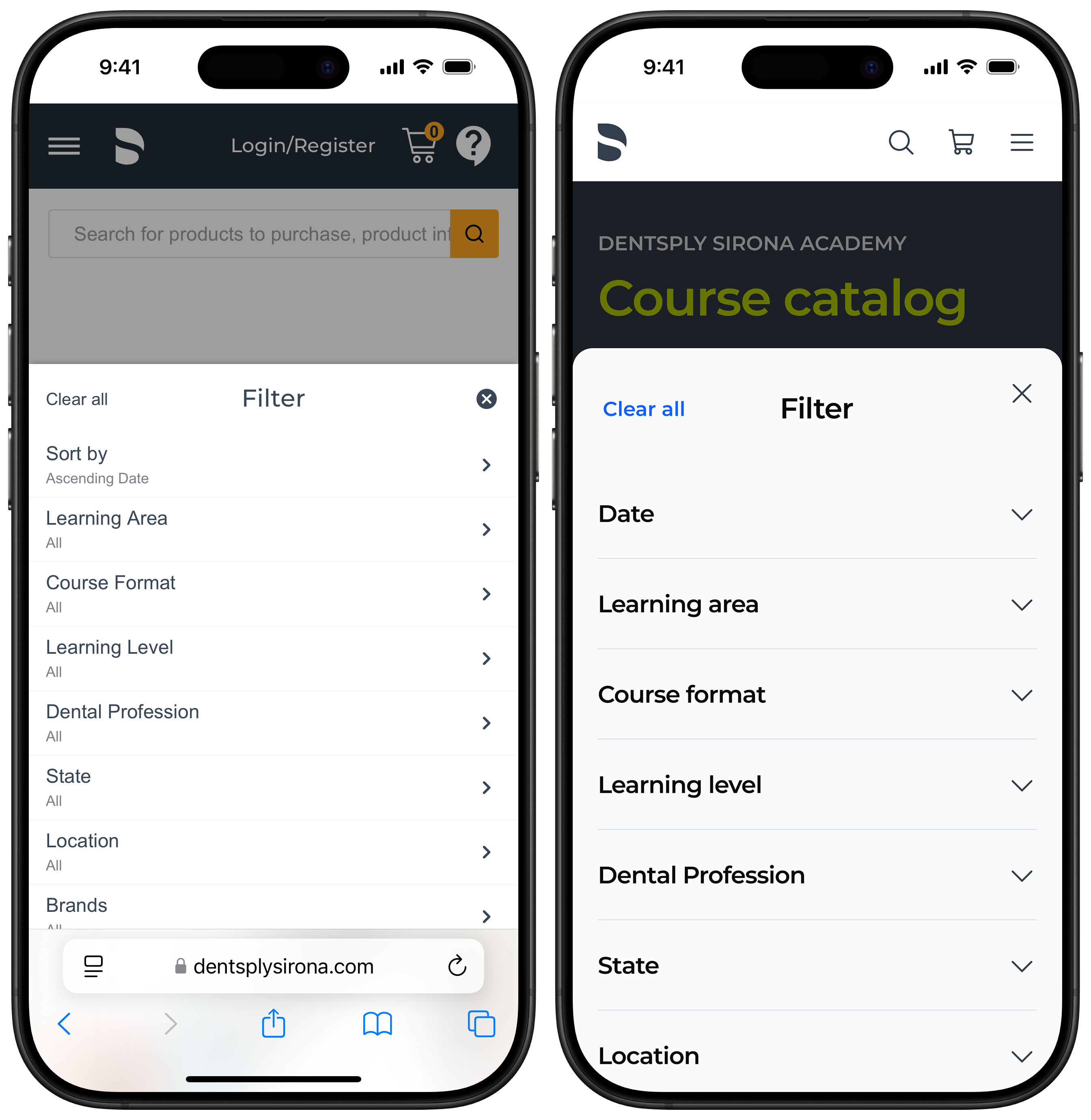
The Dentsply Sirona Academy course catalog had grown into a cluttered, hard-to-scan page. The original design buried the value proposition behind a promotional banner and a full-width search bar, and there was no clear entry point for a dental professional trying to find continuing education relevant to their role.
The redesigned catalog leads with a clear headline and description, followed by a prominent filter control so users can narrow by learning area, course format, profession, and more. The filter panel itself was simplified from a dense nested list into a clean accordion that felt native to mobile.
Standardized core task flows
We identified the ten most common tasks in the platform (things like scheduling a new patient, pulling up a clinical record, and submitting a claim) and audited each one for consistency. Seven of the ten had meaningful inconsistencies: different terminology for the same action, different button placements, or different numbers of steps depending on how you entered the flow.
We systematically standardized these flows. Same language, same interaction patterns, same placement of primary actions. The work was less glamorous than a visual redesign, but the impact was more durable. Users who learned one flow could now reliably predict how a similar flow would work.
Clearer empty states and error messages
A surprising number of support tickets were triggered by empty states (screens that showed nothing because no data existed yet) and error messages that didn't explain what to do next. These are easy UX wins that require almost no engineering effort, but they compound into significant support savings at scale.
We rewrote every empty state to explain why it was empty and what the user could do. We rewrote error messages to use plain language and tell users the next step rather than just describing what went wrong. These changes rolled out quickly and had an immediate measurable effect on the support queue.
Strengthening the design team
Part of my mandate was to raise the overall quality of design output from the team. I introduced a structured design review process: weekly critiques where work-in-progress was presented, questioned, and improved before it moved to engineering. I also established a shared component library in Figma to reduce inconsistency and speed up design iteration.
The review process created accountability and raised the floor. Designers brought better-prepared work to reviews, and stakeholders stopped seeing half-formed ideas in sprint demos for the first time.
Design system
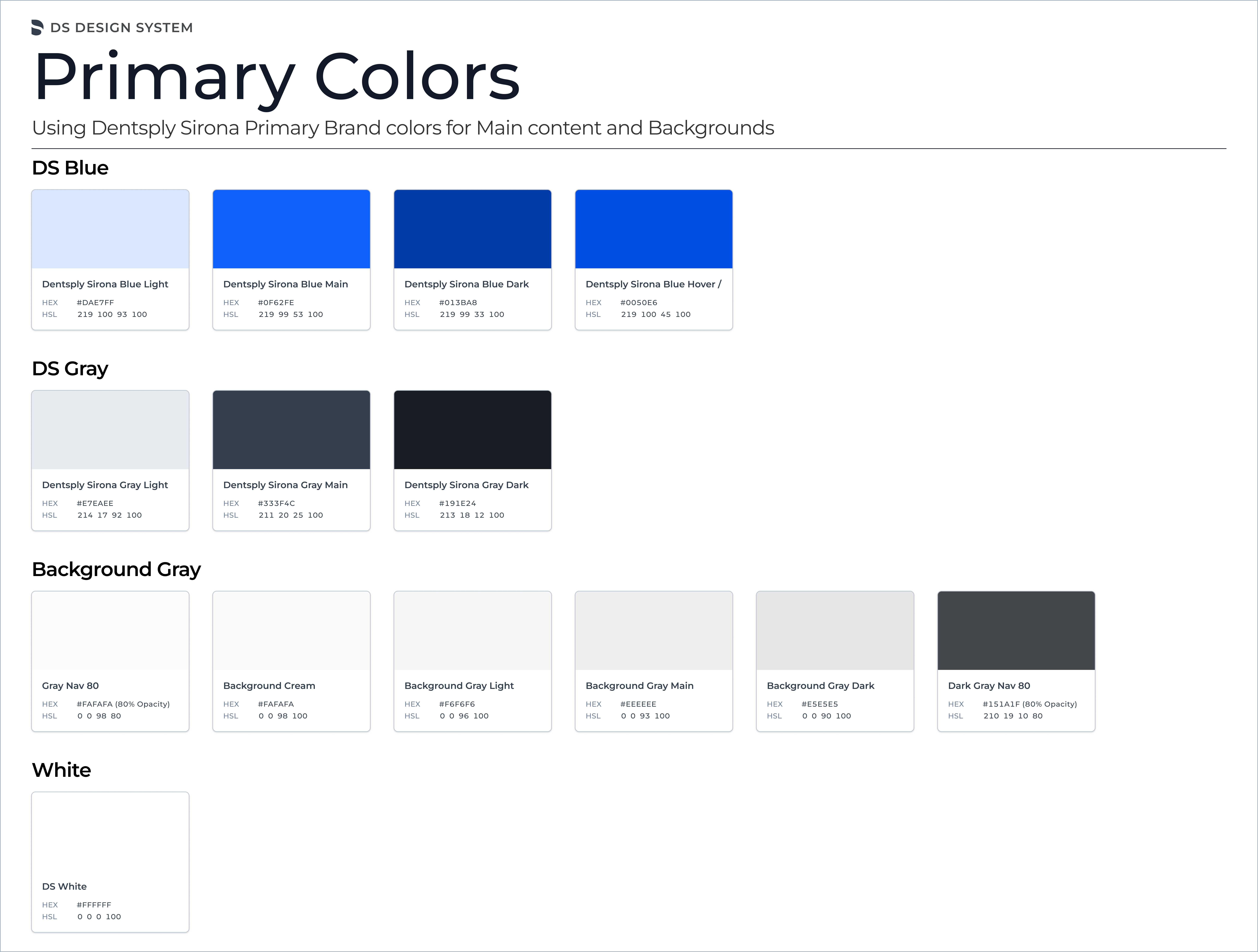
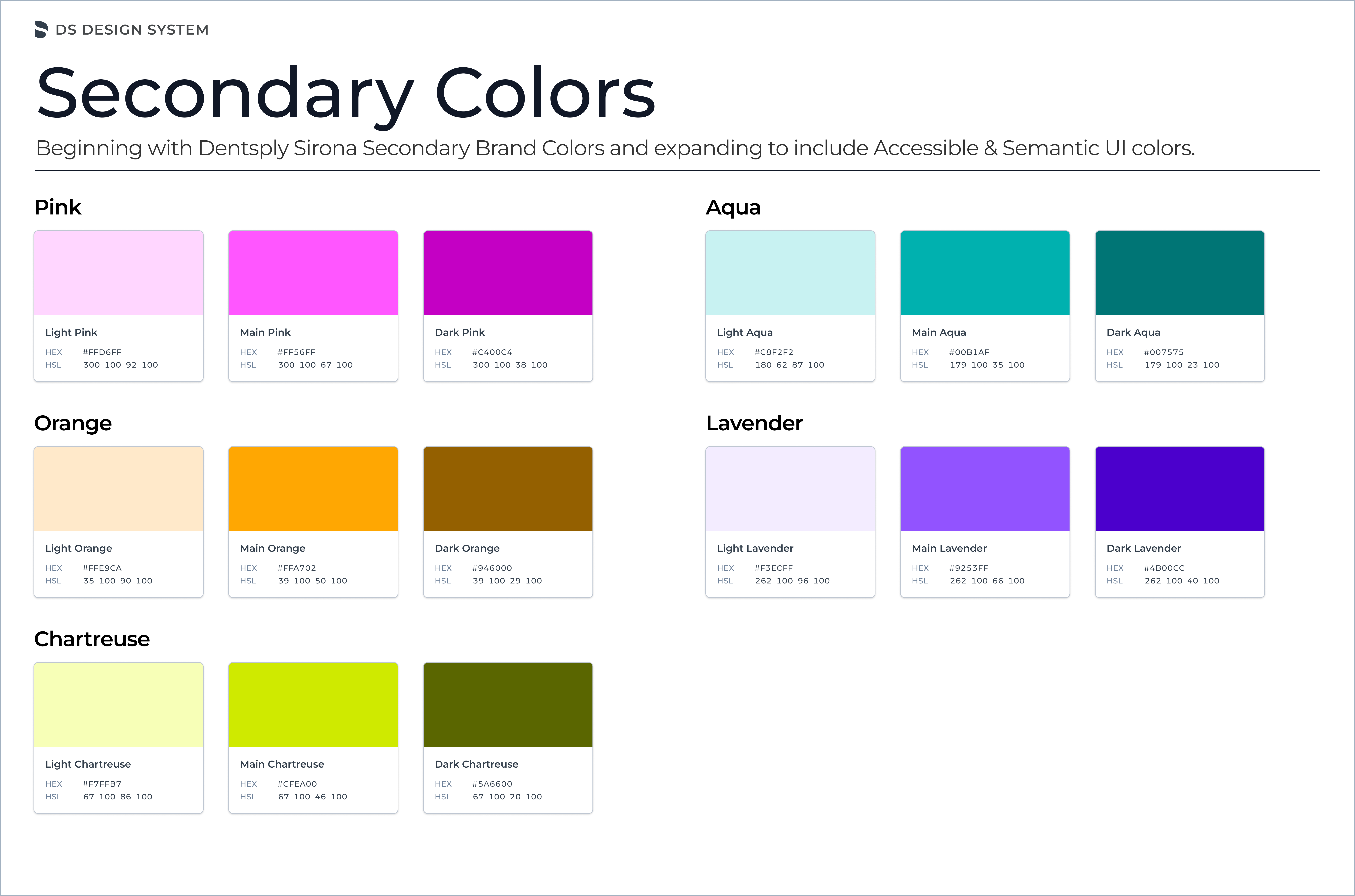
A core part of the redesign was establishing a shared design system that could scale across the platform and support a global team of designers and developers. I built out the foundations in Figma, starting with color and typography, which informed every component and pattern that followed.
Color
The color system was built to balance Dentsply Sirona's established brand identity with the functional demands of a clinical interface. The primary palette anchors brand recognition across the platform, while the secondary palette provides the flexibility needed for data visualization, status indicators, and role-specific UI contexts. All color combinations were evaluated against WCAG AA contrast requirements to ensure accessibility across the global user base.
Typography
Before the design system, type usage across the platform was inconsistent: different teams had introduced their own size scales, weight choices, and line heights over time. The new type system defined a single scale for both desktop and mobile, with explicit rules for headings, body text, labels, and captions. Locking this down removed a significant source of visual noise and made the interface feel more coherent without requiring any structural redesign.
Input fields
Form inputs appear throughout the platform in scheduling, clinical records, billing, and account management. Standardizing them meant defining every state explicitly: default, focused, and error. The error state in particular had been handled inconsistently before, which contributed to user confusion when something went wrong. Having a single, clearly documented input component that every designer and developer could reference reduced both implementation time and the number of one-off variations shipped.
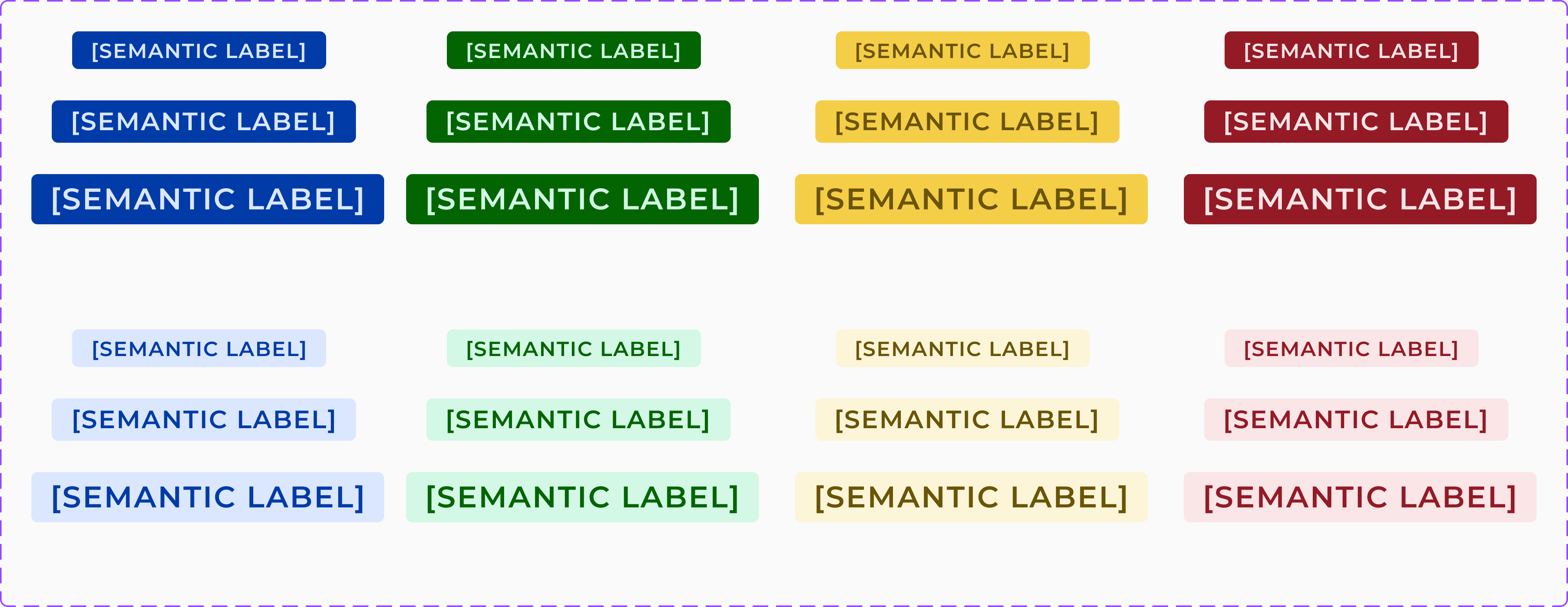
Labels and chips
Labels and chips carry a lot of meaning in a clinical platform. They communicate appointment status, record states, task priority, and user roles at a glance. The system defined two distinct component types: chips for interactive filtering and selection, and semantic labels for displaying categorical status. Giving each a defined color vocabulary and size scale meant that anyone in the platform could immediately understand what a label meant, without needing to read the text to interpret the context.
Results
What I learned
Healthcare software design reinforces something I believe strongly: the best UX work is often invisible. When the navigation is right, users don't notice it. They just do their work. The goal is to get out of the way.
I also learned the value of working closely with the support team. In most organizations, support data is underused by product and design teams. It's one of the richest signals available: real users, real problems, real frequency. At Dentsply Sirona, support ticket analysis gave us the clearest picture of user pain that any research method we used.
Finally, this role reminded me that design leadership isn't just about your own work. It's about raising the quality of everything the team produces. The process changes I made (design reviews, component library, role-mapping workshops) had as much impact as the design decisions themselves.