Context
A site organized like the org chart, not the customer
Dentsply Sirona's product portfolio spans imaging equipment, CAD/CAM systems, implants, endodontics, and clinical education, much of it regulated and all of it technical. Decades of acquisitions had left dentsplysirona.com with tens of thousands of URLs across regional variants, three parallel content universes ("Discover," "Academy," and "Support"), and page templates that varied brand-by-brand.
The people who suffered were clinicians. A dentist looking for an endodontic file system had to know which internal division made it before they could find it. The data told the same story: customers were routing around the site entirely, calling support or leaving for distributors.
Research
Auditing 30,000 pages before touching a pixel
I anchored the project in three research streams, deliberately sequenced so that every design argument later would be backed by data the stakeholders had already accepted.
1. Content and traffic audit
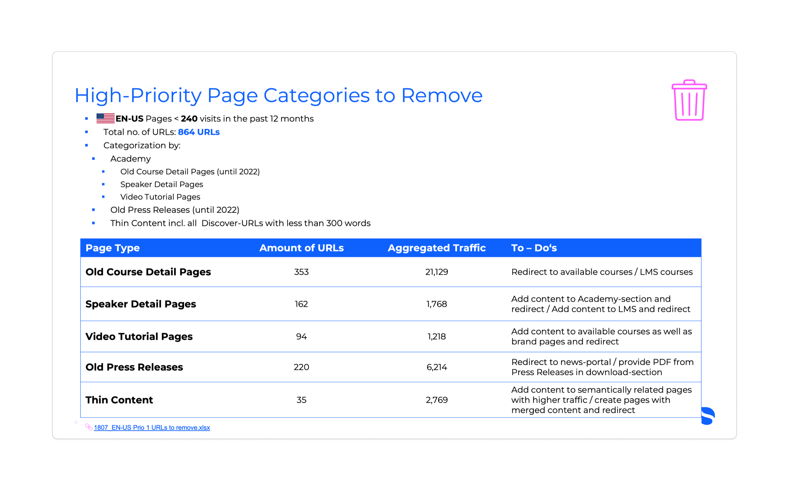
Working with the SEO lead, we mapped every EN-US URL against twelve months of traffic. The result was impossible to argue with: 864 high-priority URLs (old course pages, speaker bios, stale press releases, thin content) earned fewer than 240 visits a year. Each got an explicit disposition: redirect, consolidate, or retire.
2. IA audit of the current state
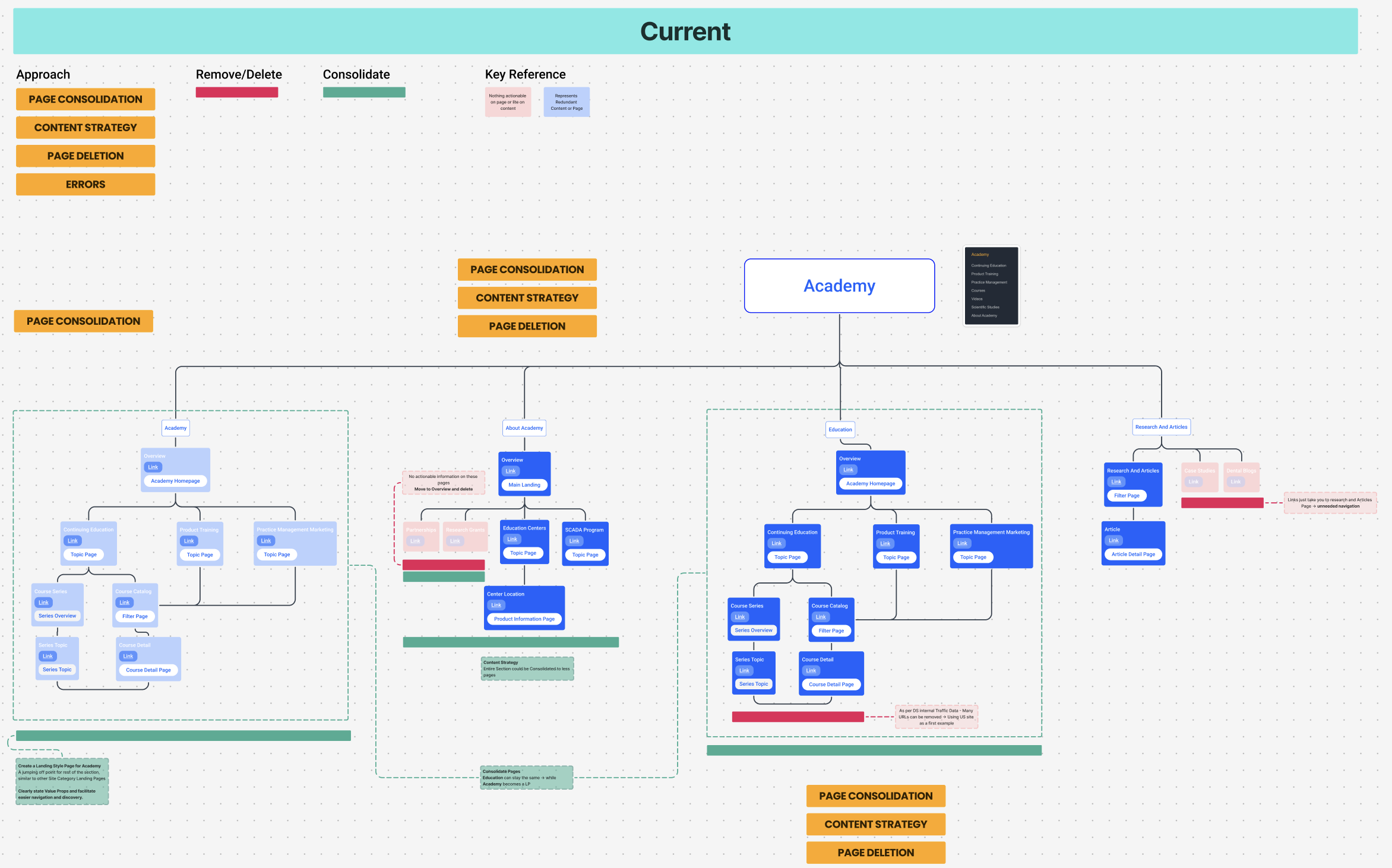
We mapped the existing sitemap section by section, annotating every consolidation, deletion, and redundancy directly on the diagrams. The Academy section alone contained three parallel paths to the same course content.
3. Brand expectation benchmarking
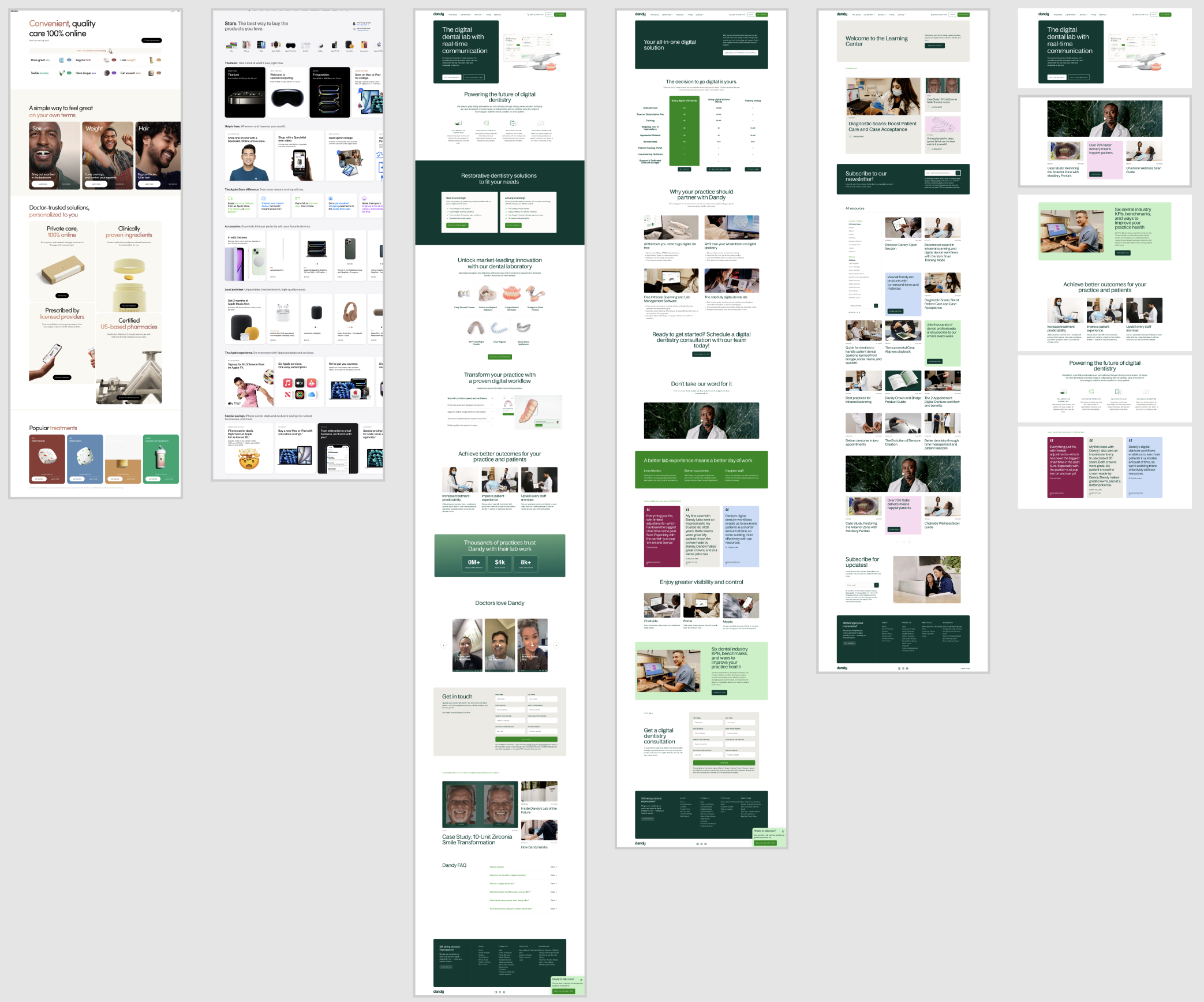
Clinicians don't compare Dentsply Sirona to other device manufacturers. They compare it to the best digital experience they used that morning. We benchmarked the site against consumer-grade leaders (Apple's store, Hims, digital-dental challenger Dandy) across home, shop, list, and detail pages to define the experience bar the redesign had to clear.
Baseline: tree testing
Finally, we ran unmoderated tree tests with 250 dental professionals on the existing structure. Baseline findability task success: 54%. Nearly half of realistic find-a-product tasks failed. That number became the project's north star.
Design
One taxonomy, one navigation, search everywhere
Future-state information architecture
The new sitemap reorganized the entire site around how clinicians shop and learn, by brand, by category, and by specialty, instead of by internal division. "Discover" and "Academy" were rebuilt as customer-facing taxonomies with clear landing pages, and the 864 flagged URLs were redirected into the consolidated structure so equity wasn't lost.
Navigation v2
The legacy header hid the site's most valuable tool, search, behind an icon, and reduced the product catalog to a vague "Explore." The redesigned navigation made three decisive moves:
- Search became a persistent, full-width field in the header on every page, with no icon tap required.
- "Shop" earned a top-level position ahead of Explore and Learn, reflecting the taxonomy work beneath it.
- Sign-in was surfaced as a labeled button, replacing an anonymous avatar icon that testers consistently overlooked.


Search that understands the catalog
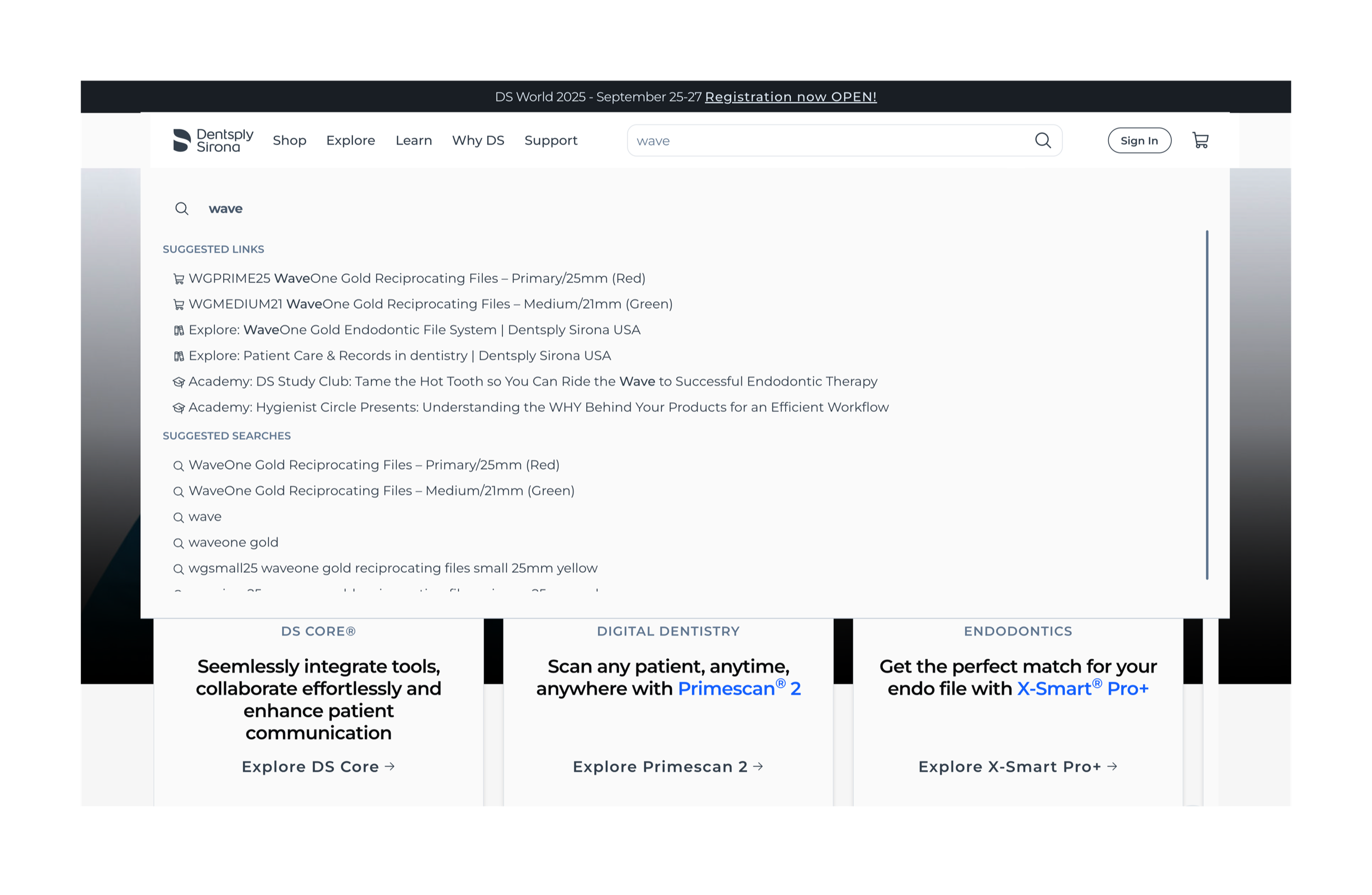
With search promoted, it had to deliver. We designed autosuggest around the three things clinicians actually look for: products (with SKUs), education content, and support. A query like "wave" resolves straight to WaveOne Gold file systems, related Academy courses, and suggested searches.
Impact
Findable, measurable, and felt by support
On-site search usage rose 31% once the field was persistent. More importantly, search-to-detail-page click-through improved because autosuggest matched clinician vocabulary. Organic sessions grew 12% in the two quarters after consolidation as redirected equity concentrated on the surviving pages.
Beyond the numbers, the audit-first approach changed how the organization works: the content disposition framework we built is now the standing process for every new page the regional teams publish.
Reflection
What I took away
- IA before UI. The navigation redesign succeeded because the taxonomy beneath it was rebuilt first. A prettier header over the old structure would have moved nothing.
- Audits create alignment. Attaching twelve months of traffic data to every deletion recommendation turned a political fight into a spreadsheet review. Stakeholders across regulatory, regional, and brand teams signed off in a single round.
- Benchmark against experiences, not competitors. Setting the bar at "best thing your customer used this morning" produced a far more honest brief than a category teardown would have.