Context
A marketplace that outgrew its interface
Net32 competes on price transparency: dentists compare offers from hundreds of vendors the way travelers compare flights. The business had product-market fit; the experience hadn't kept up. Years of feature-by-feature shipping left the site with a patchwork UI: multiple button styles, hard-coded colors, inconsistent components across squads, and a mobile experience where core actions were buried behind a hamburger menu.
There was also no UX infrastructure. Design requests arrived as JIRA tickets with no intake process, no review cadence, and no shared source of truth. Fixing screens without fixing the system would have been painting over rust, so I scoped the work as three parallel streams: the system, the experience, and the practice.
Stream 1 · The System
A token-based design system, from primitives up
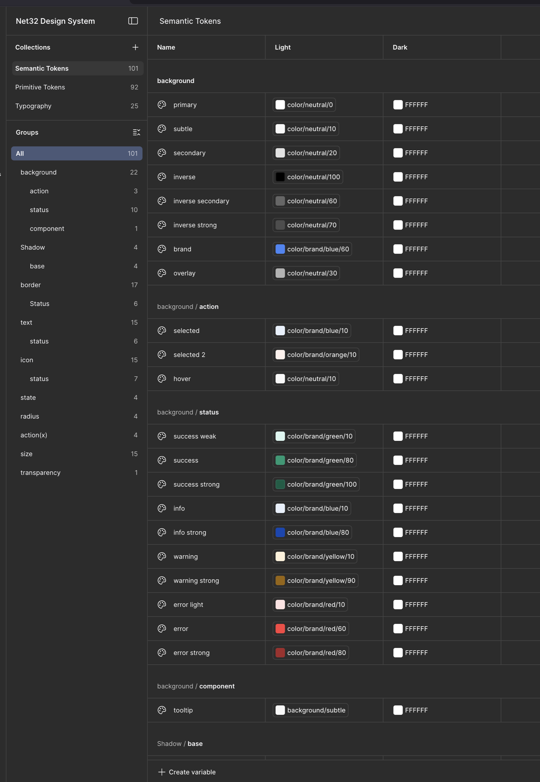
We built the Net32 Design System in Figma on a two-layer variable architecture: 92 primitive tokens (raw color ramps, size scales) referenced by 101 semantic tokens (background/action/selected, border/status/error, text/status) plus 25 typography tokens. Components never touch a raw hex value, which means a rebrand, or the dark mode already scaffolded into the token table, is a variable swap rather than a redraw.
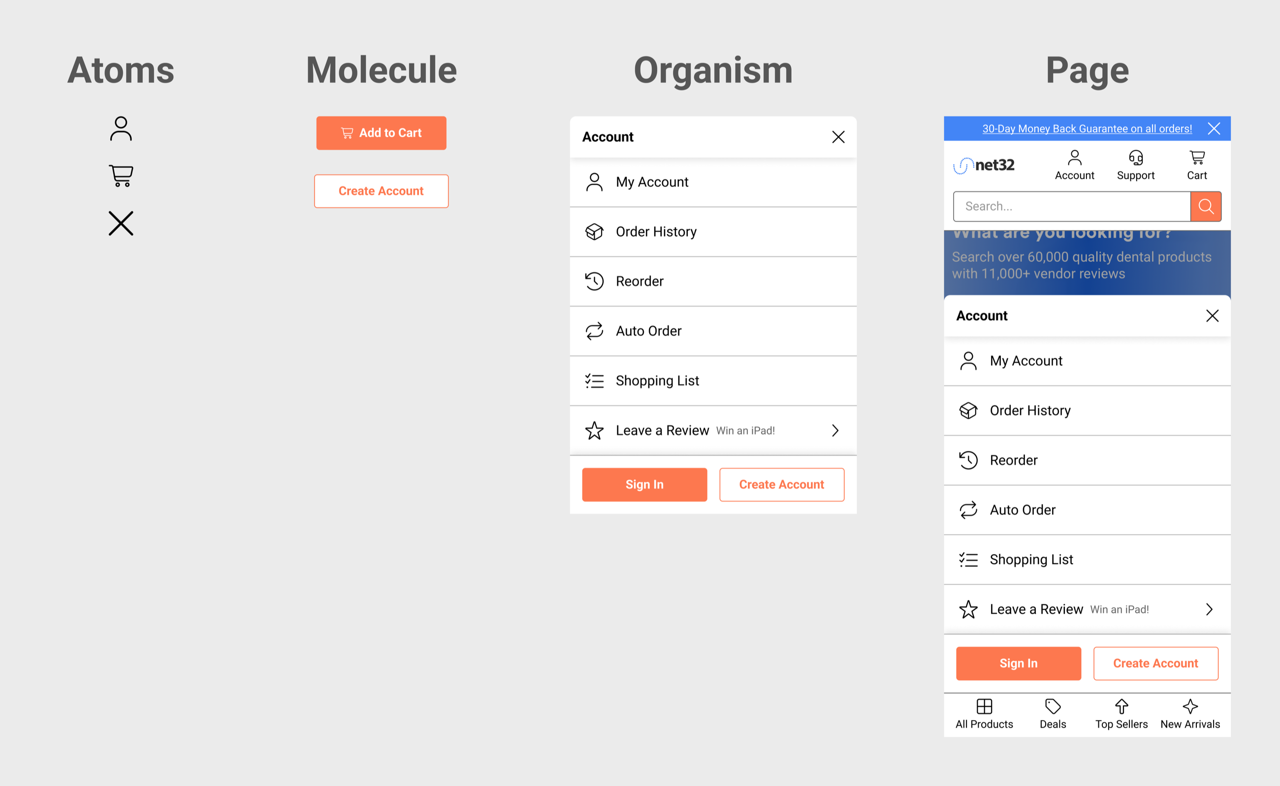
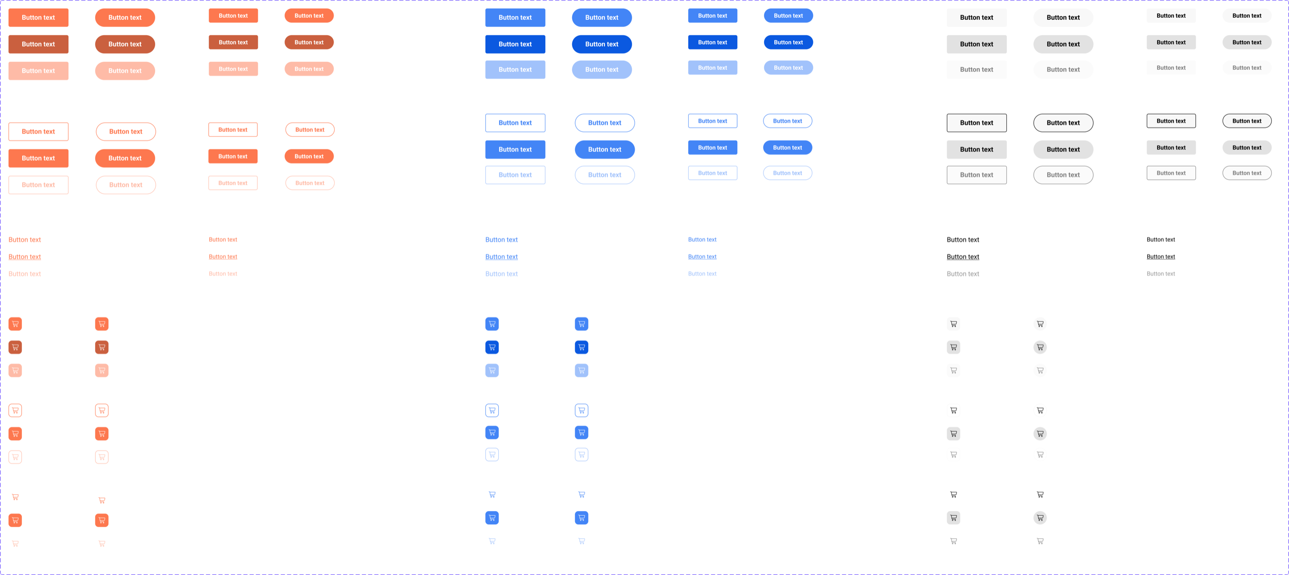
On top of the tokens we built components following atomic design: atoms compose into molecules, organisms, and finally full page templates, so every level of the system stays consistent by construction.
Stream 2 · The Experience
Redesigning the shopping journey with the system
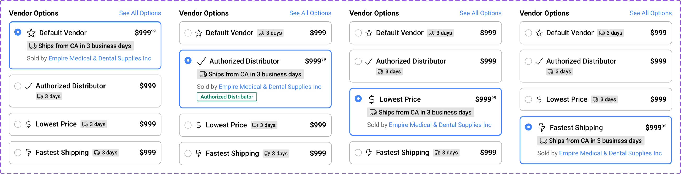
The design system proved itself by shipping. We rebuilt the highest-traffic surfaces (header, home page, and footer) as the first production consumers of the new components.
Header: search first, actions labeled
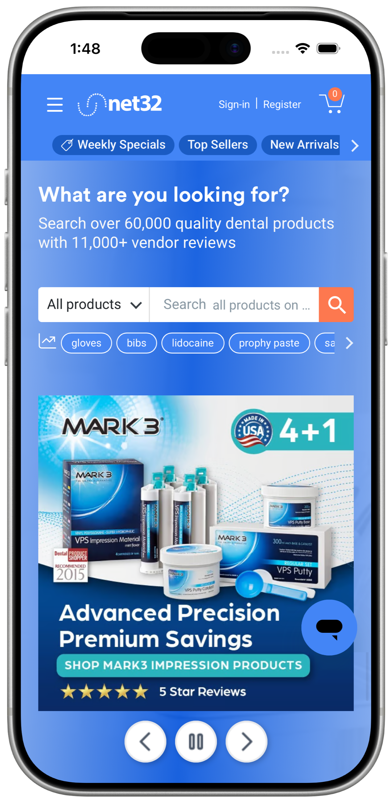
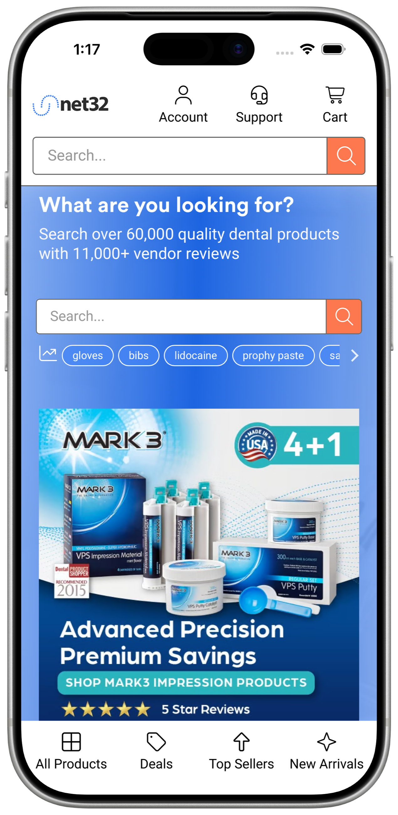
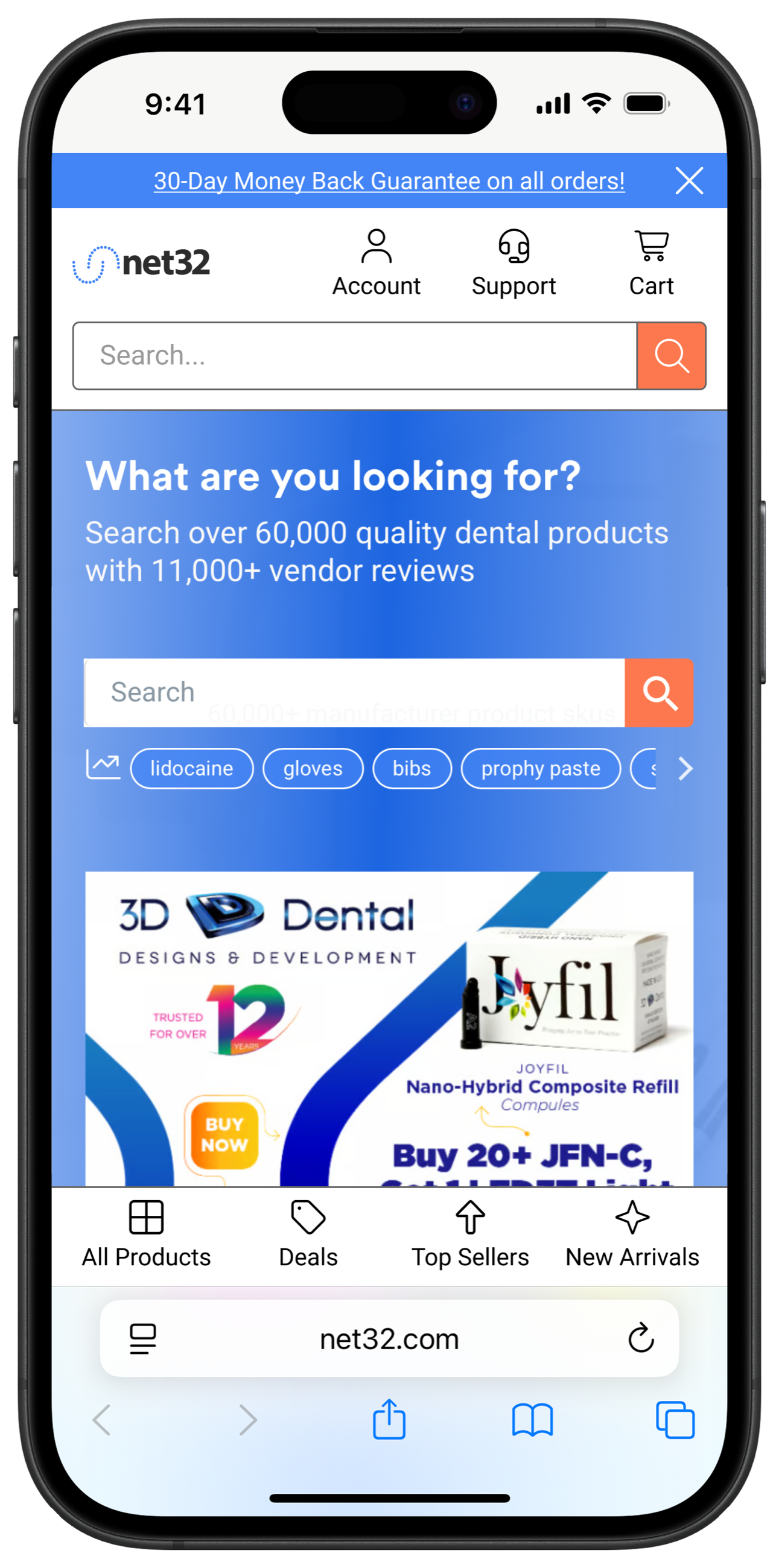
The legacy blue header buried navigation in a hamburger and crowded the top bar with links. The redesign gave the search bar the hero position (search drives the majority of product discovery on Net32), replaced the hamburger with labeled Account / Support / Cart actions, and moved primary browse paths into a persistent bottom tab bar on mobile.
Footer: from link dump to conversion surface
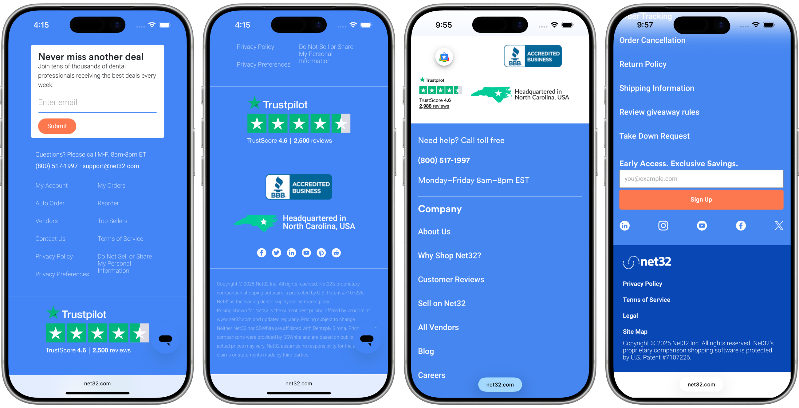
The footer was rebuilt around the things customers actually scroll down for: deal alerts (email capture moved to the top), human support hours and a toll-free number, and trust signals (Trustpilot score, BBB accreditation, US headquarters) that matter when a practice is choosing between an unknown vendor and a known one.
Stream 3 · The Practice
Making UX an operating system, not a service desk
A system only survives if the organization around it works. I documented and rolled out the UX operating model: how work enters, how it's sized, how it's reviewed, and who decides:
- Project intake and sprint planning. A structured intake form (problem, goal, success measure) replaced drive-by ticket assignments, and UX joined sprint planning with t-shirt sizing.
- Design review cadence. Twice-weekly design reviews with a defined format (context, decisions needed, feedback rounds) so engineering saw work before it hardened.
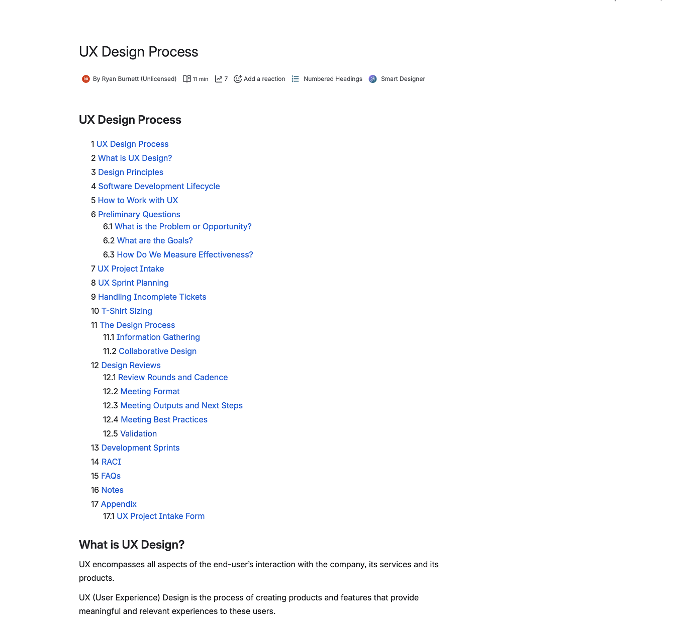
- Documentation as onboarding. The full process lives in Confluence, from design principles through RACI and validation, cutting new-designer ramp-up from weeks to days.
Impact
Faster shipping, cleaner UI, better numbers
The redesigned mobile experience converted 12% better than the legacy pages in post-launch measurement, UI defect reports dropped 40% as hard-coded styles disappeared, and home page bounce fell 14%. Just as important: squads stopped debating button styles and started debating customer problems.
Reflection
What I took away
- Tokens are leverage. The primitive/semantic split felt like overhead in week one and paid for itself by month two. Every downstream screen inherited consistency for free.
- Ship the system through real work. Rebuilding the header, home, and footer as the system's first consumers kept it honest. A design system validated only by its own documentation is a library, not a system.
- Process is a design deliverable. The intake form and review cadence moved the needle as much as any screen. They're why the handoff metric moved.